 Free GEO Audit
Mirae-N, Digital Choco
Mirae-N Digital Choco Website Design
KEYWORD #WebAgency #MiraeN #DigitalChoco #EducationPlatform #GenerativeAI #WebsiteDesign #WebAgency
DATE 2026
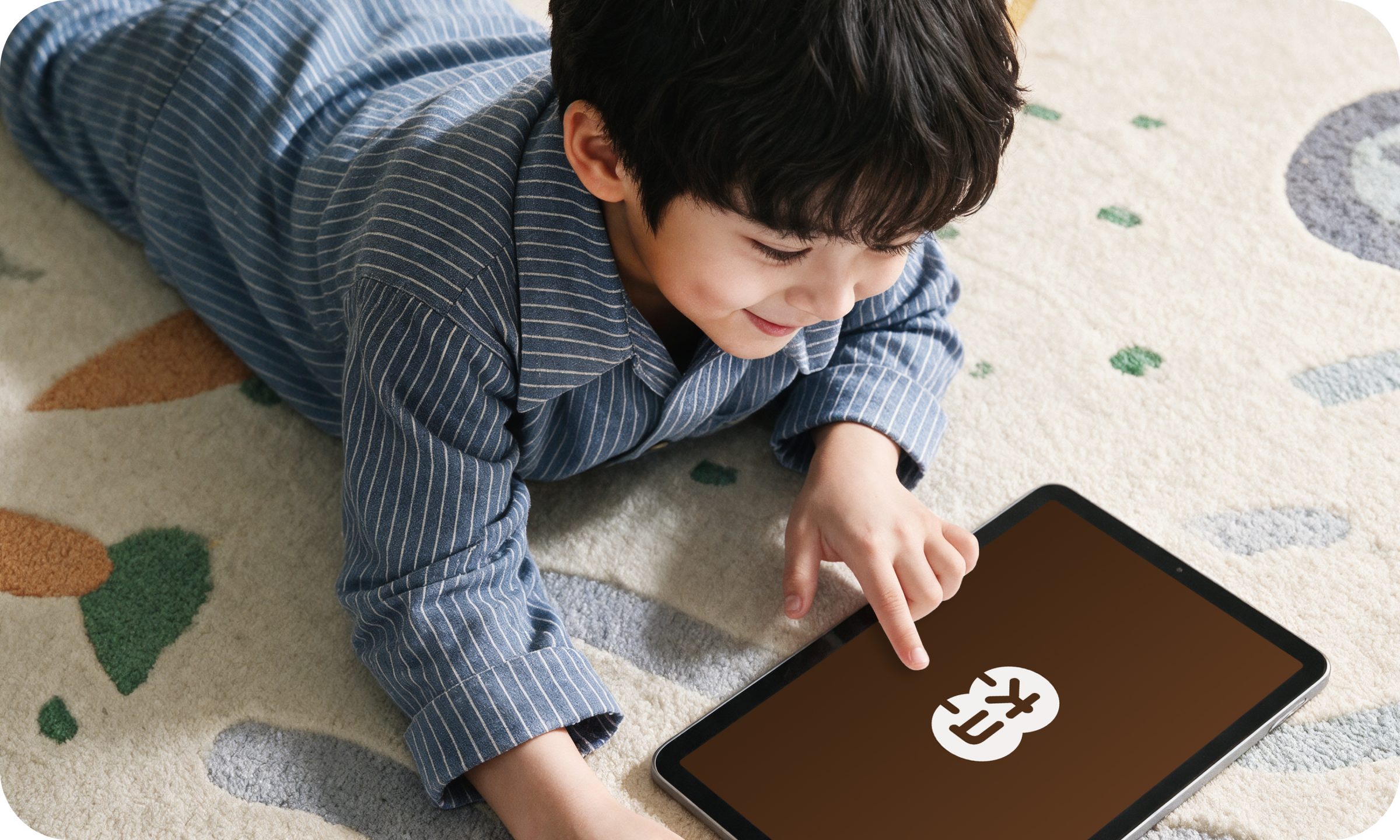
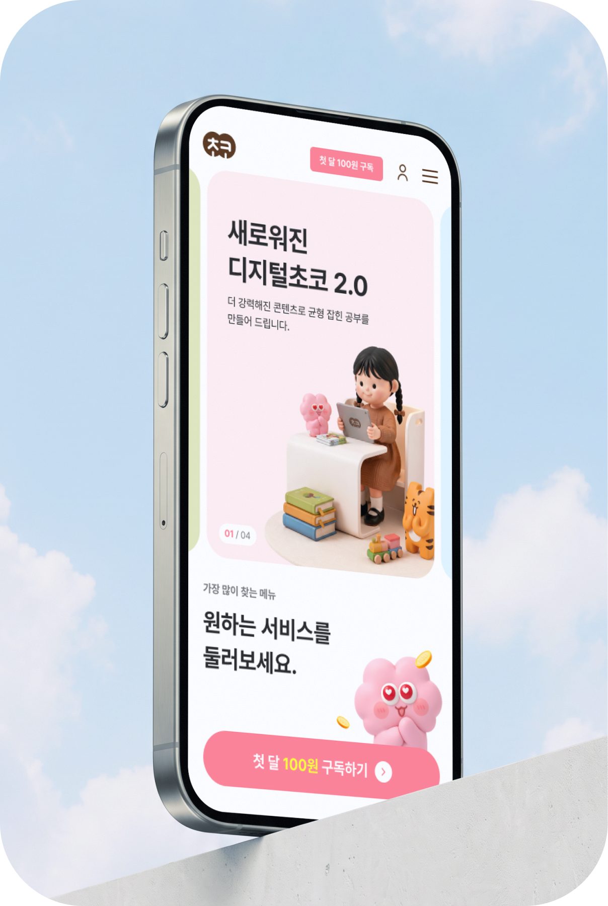
The Mirae-N Digital Choco website visually translates the value of a premium education brand for elementary students and their parents into a smart elementary learning experience. We structured each screen so the core values of elementary education come across intuitively, and designed friendly visuals that let both children and parents comfortably browse a wide range of learning content. With 3D characters created using generative AI and a warm color palette, we completed a UI that embodies the brand identity, and applied responsive design to deliver a consistent brand experience on both PC and mobile.
Overview
The core of elementary learning, fun and trustworthy
Mirae-N Choco website renewal
The Mirae-N Digital Choco website renewal reorganized the many contents and services of an elementary learning platform around the user, aiming to give both children and parents a friendly, trustworthy brand experience. Soijeong designed a UX/UI that reflects the identity and content characteristics of each subject area, and brought Digital Choco's own consistent brand experience to life through AI visuals and responsive design.
 Daldal Math
 Daldal Reading
 Choco Kids
 Choco Webtoon
 Choco Time
 Daldal English
Project Challenge
One site, two users
and a growing list of services
The key challenge was to connect many services under one brand and strike a balance between children's curiosity and parents' trust.
Missing images were created with AI, and Soijeong designed device-specific screens that could actually be built, taking the development environment into account.
Fun
Fun learning with 3D characters
Trust
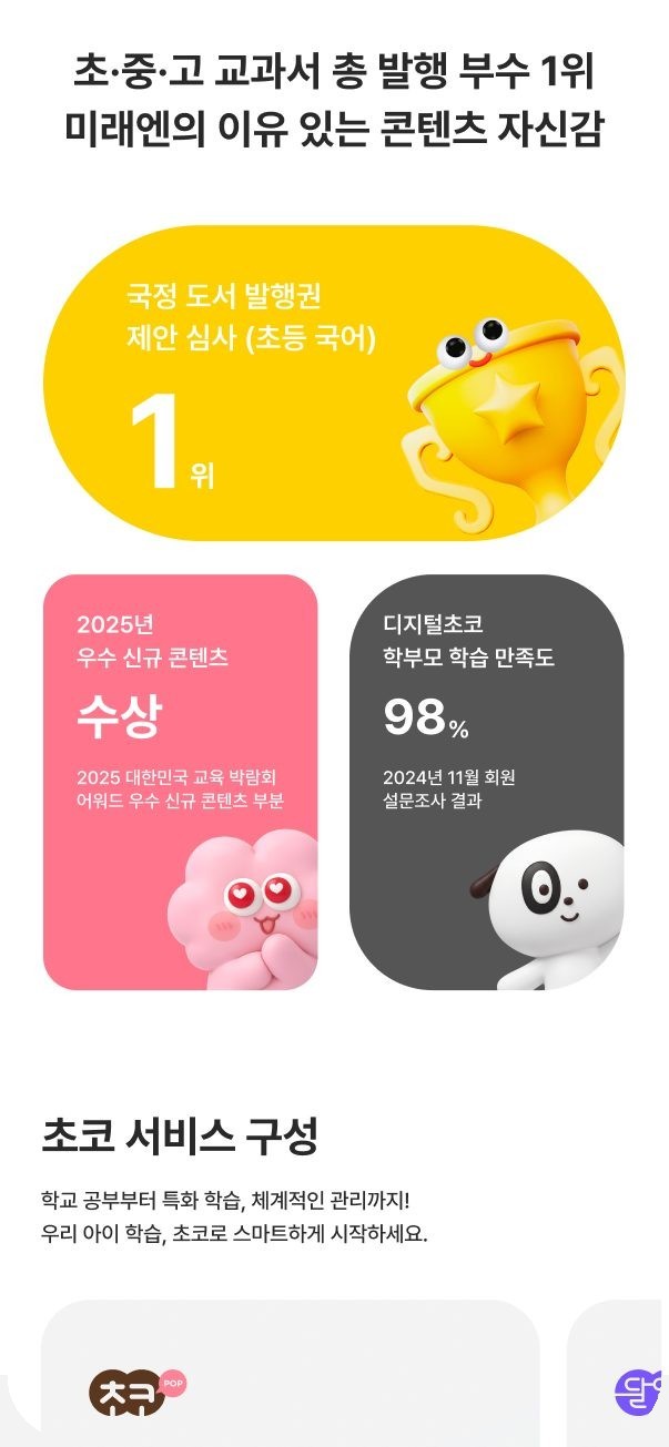
Trusted content from Mirae-N, the No. 1 textbook publisher
Easy
No contract, easy on any device
Project Goal
A brand site that is truly Choco
We streamlined a service structure that had grown complex and shortened the subscription path, so that on any device users can
grasp Choco's value at a glance and get started right away.
A site that is easy to browse,
easy to subscribe to
We reorganized scattered service information by audience and placed the 'First month for 100 won' subscription path throughout the pages
so parents can easily compare options and start right away.
AI Visual & Brand Experience
Choco's first impression, crafted with stylish AI visuals
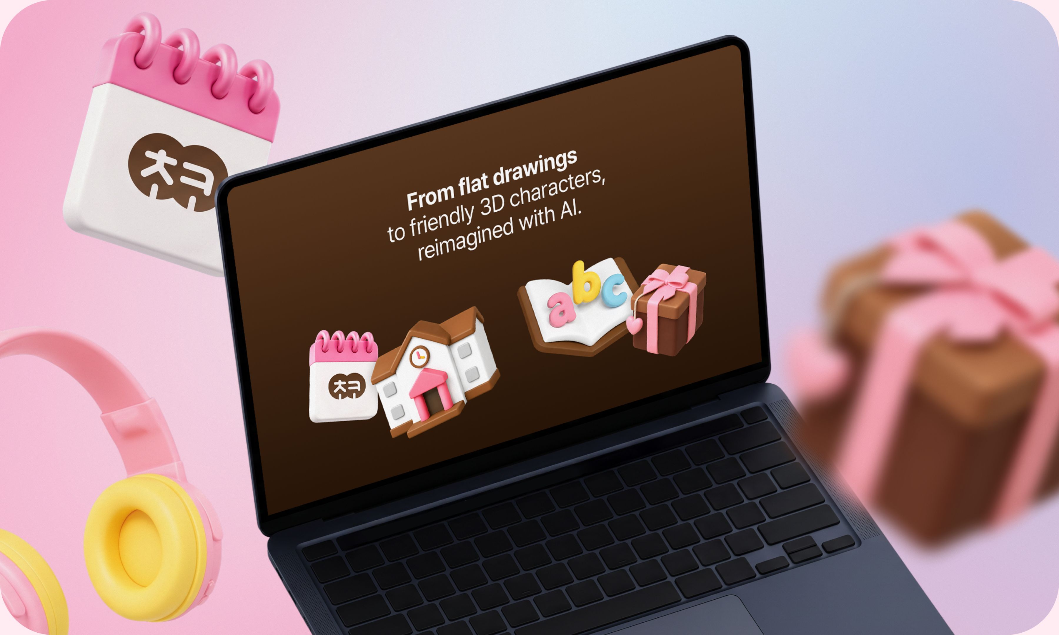
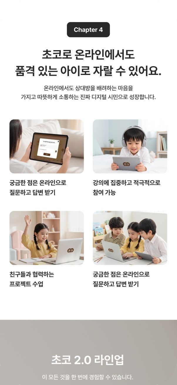
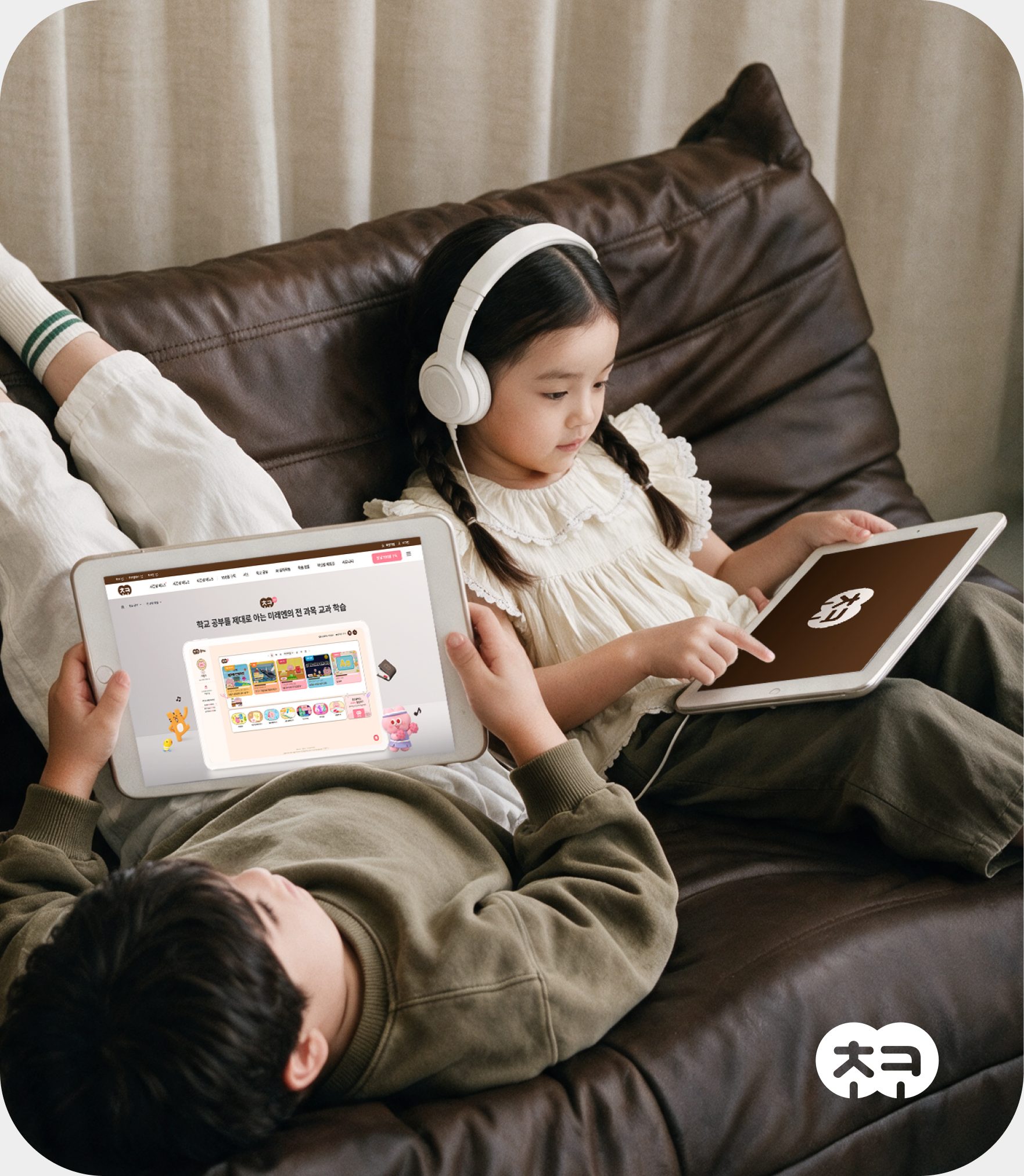
We created AI visuals to convey both friendliness and trust. Filling the gaps in imagery, we newly composed scenes of children studying and
home settings, tied them to the characters and brand colors, and visualized Choco Class with a warm learning atmosphere.
- 1AI visuals that fill the shortage of high-quality image resources
- 2Natural imagery tailored to the learning environment and user characteristics
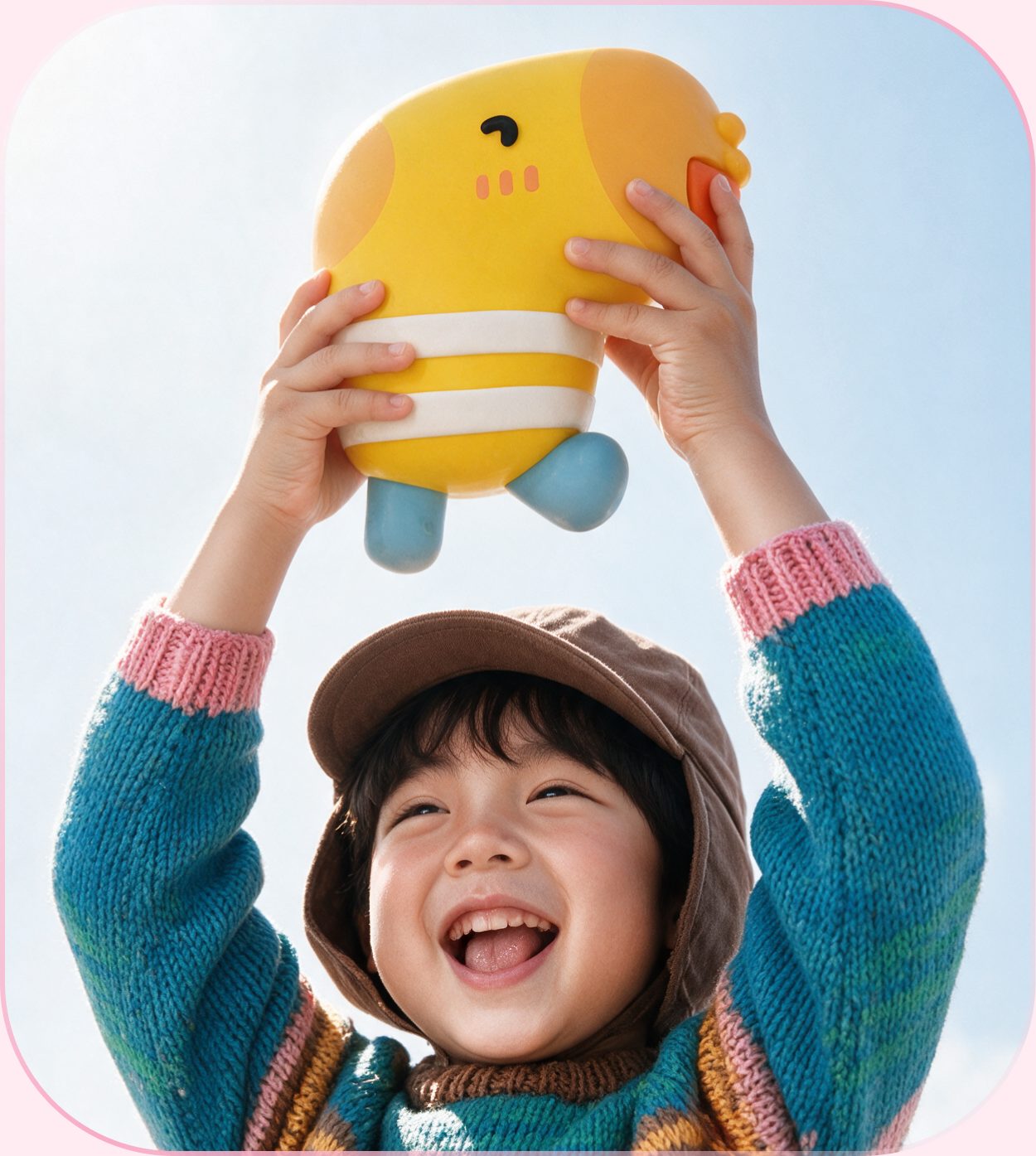
Reimagined with AI
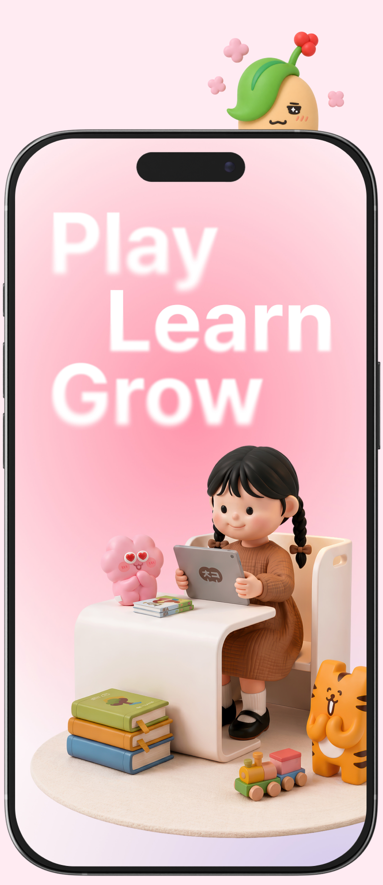
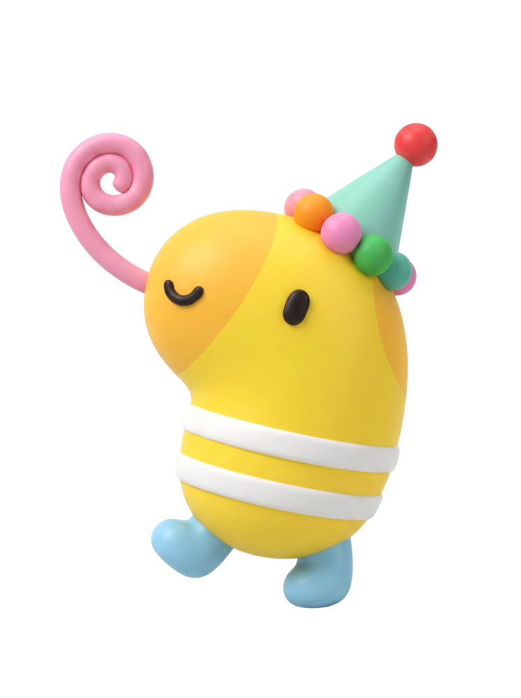
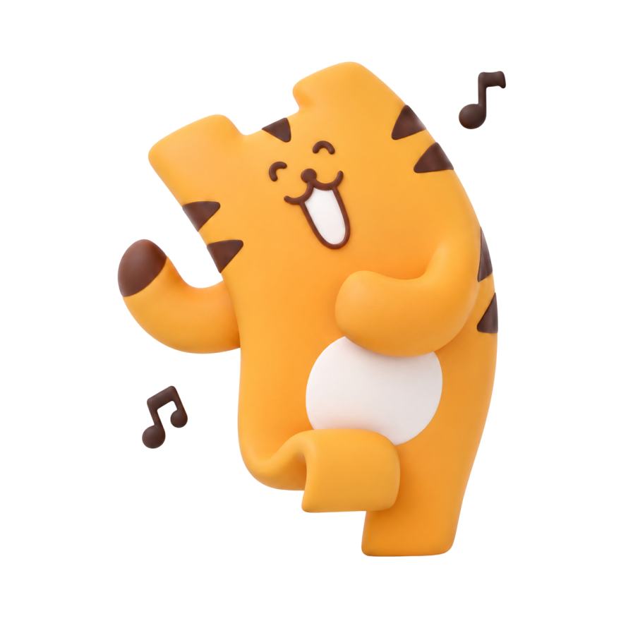
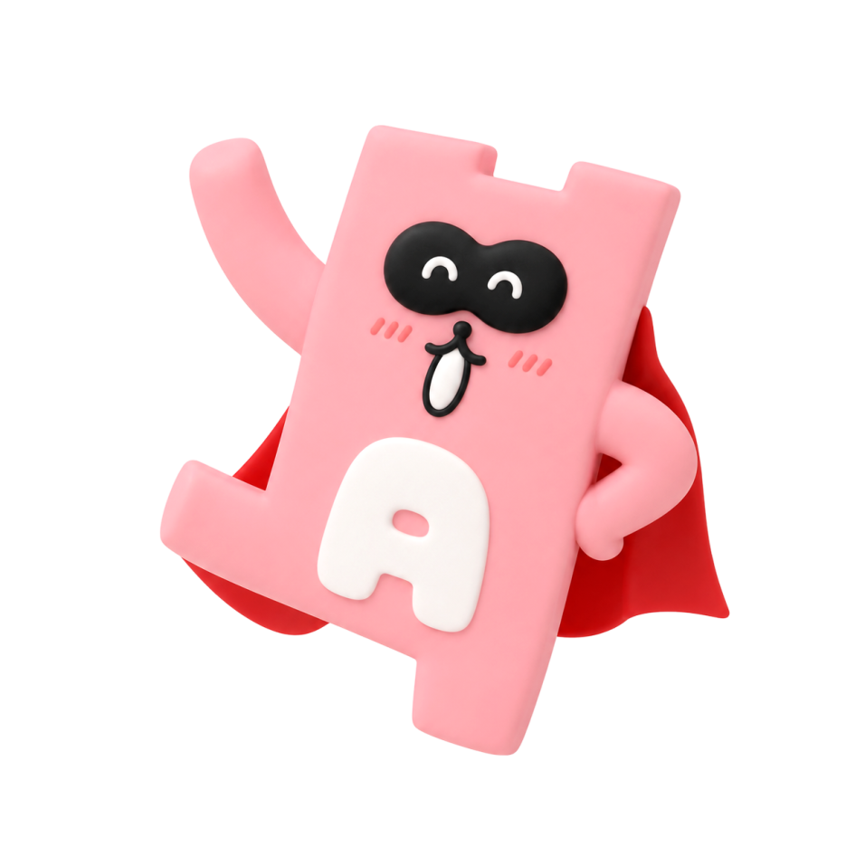
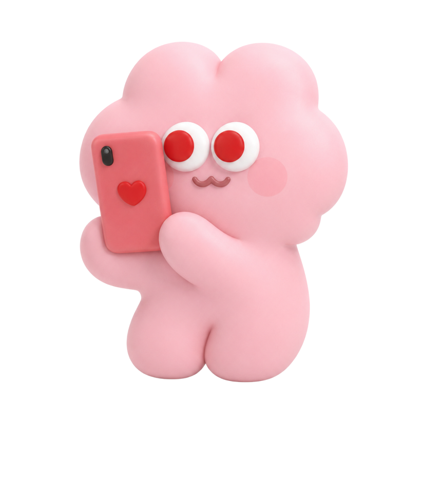
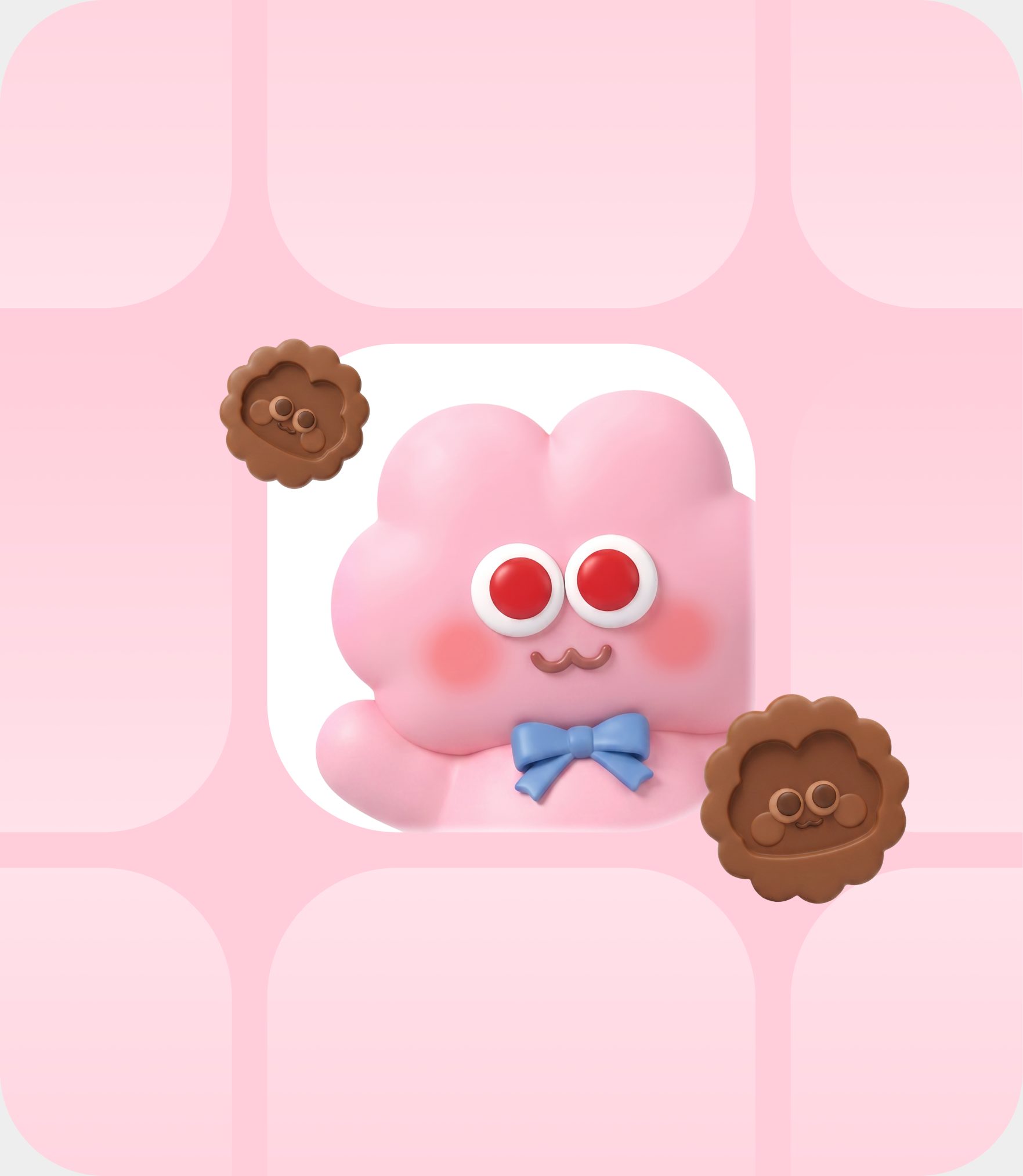
To match the content of each service page, such as Choco Time, Daldal Reading and Chocotoon, we used generative AI to create new character poses and scenes, adding a different kind of fun to every screen.

Choco Kids
Cheerleading buddy, 3D clay style
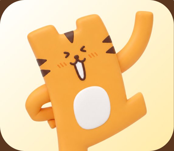
Choco Time
Dancing tiger, 3D clay style
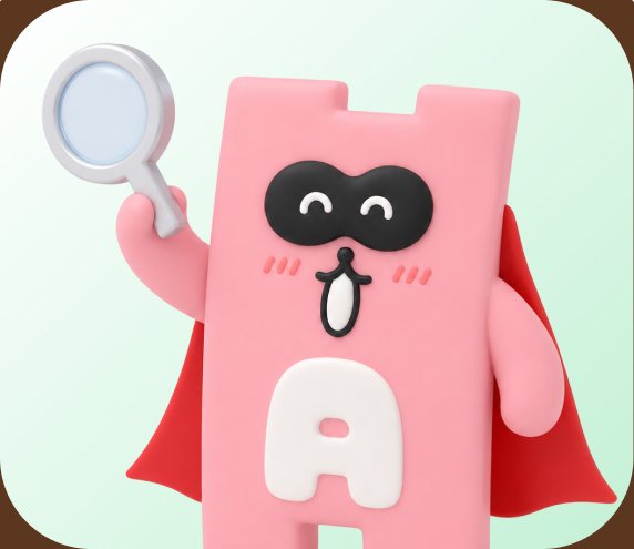
Daldal English
Superhero explorer, 3D clay style
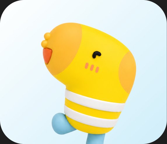
Daldal Math
Party chick, 3D clay style

Choco Webtoon
Singing ginseng, 3D clay style

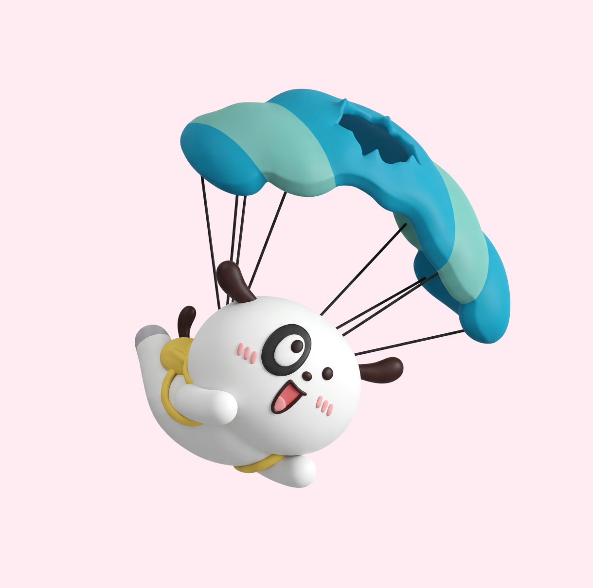
Daldal Reading
Happy puppy, 3D clay style
Daldal Math
Party chick, 3D clay style
Landing Page
A 100-won subscription experience
that showcases both the offer and the brand
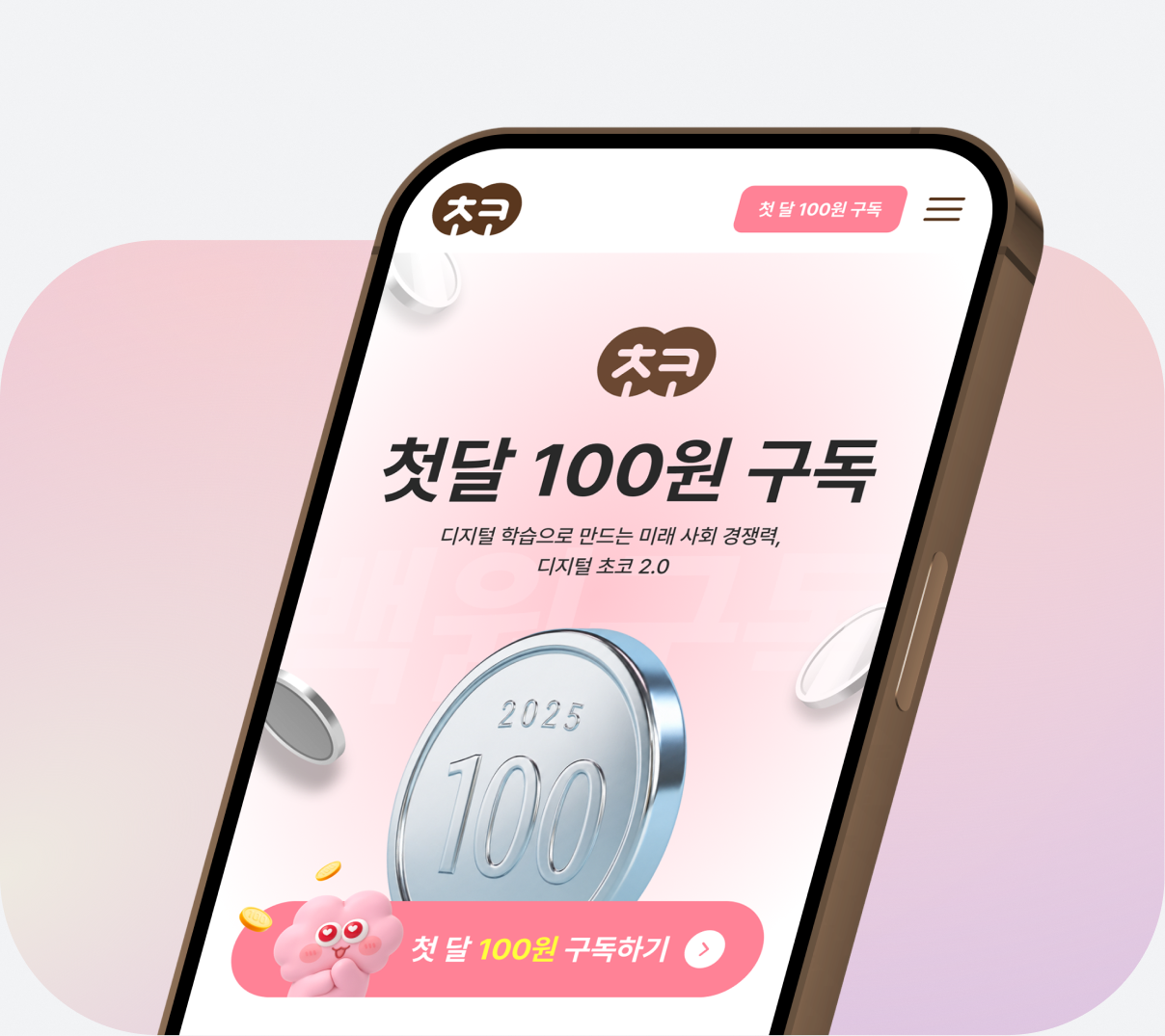
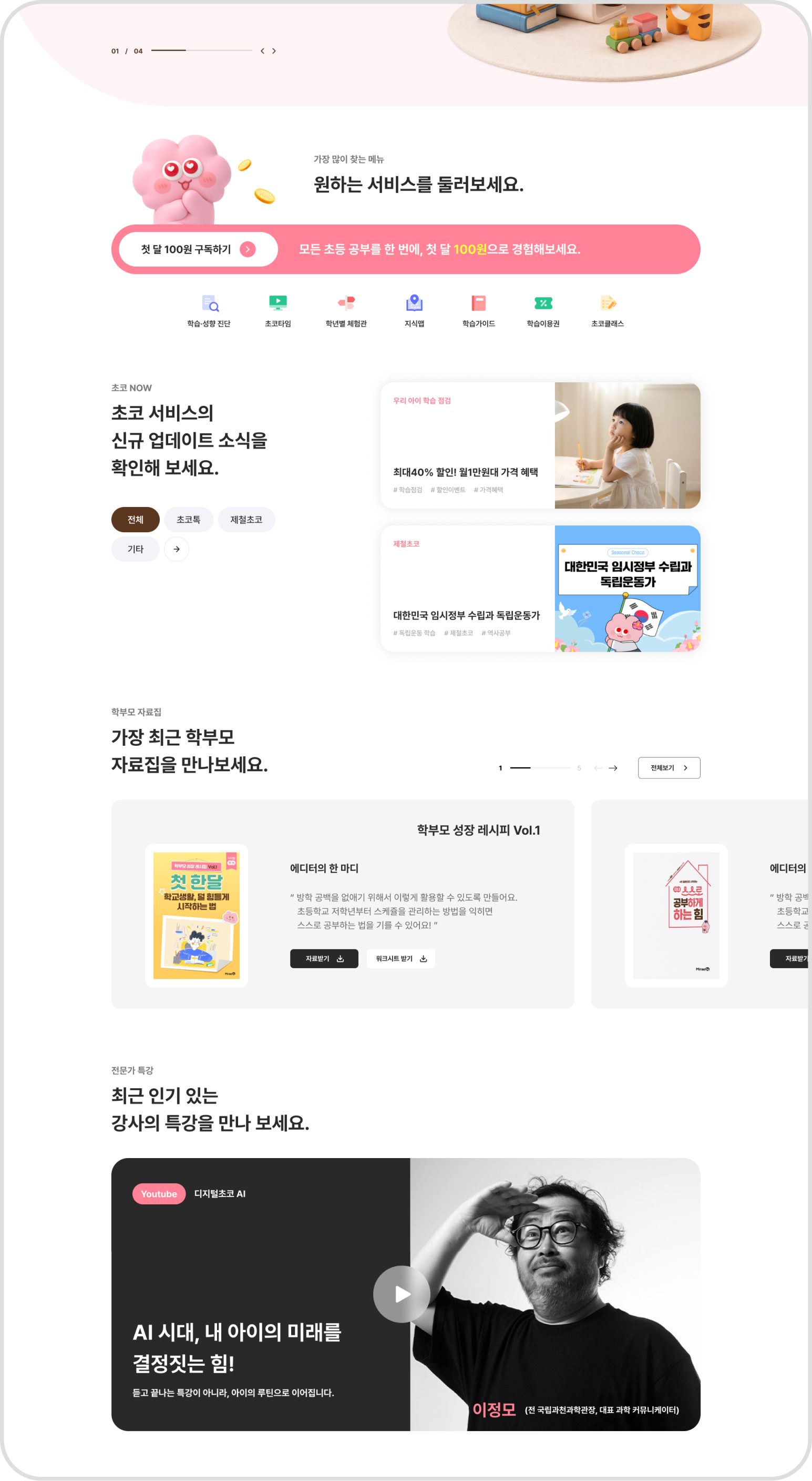
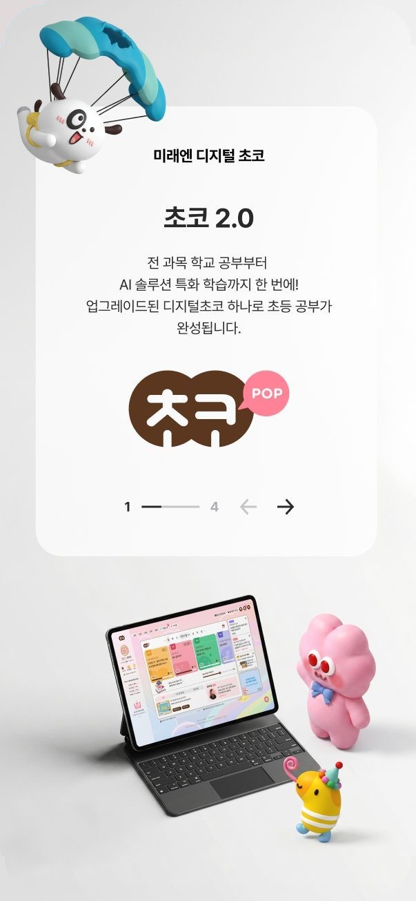
We designed a landing page that intuitively communicates the benefits of the first-month 100-won subscription promotion while also showcasing Digital Choco's brand value. Starting with a main visual that highlights the core '100 won' message, we laid out the service's trust factors, subscription benefits and key learning content step by step.
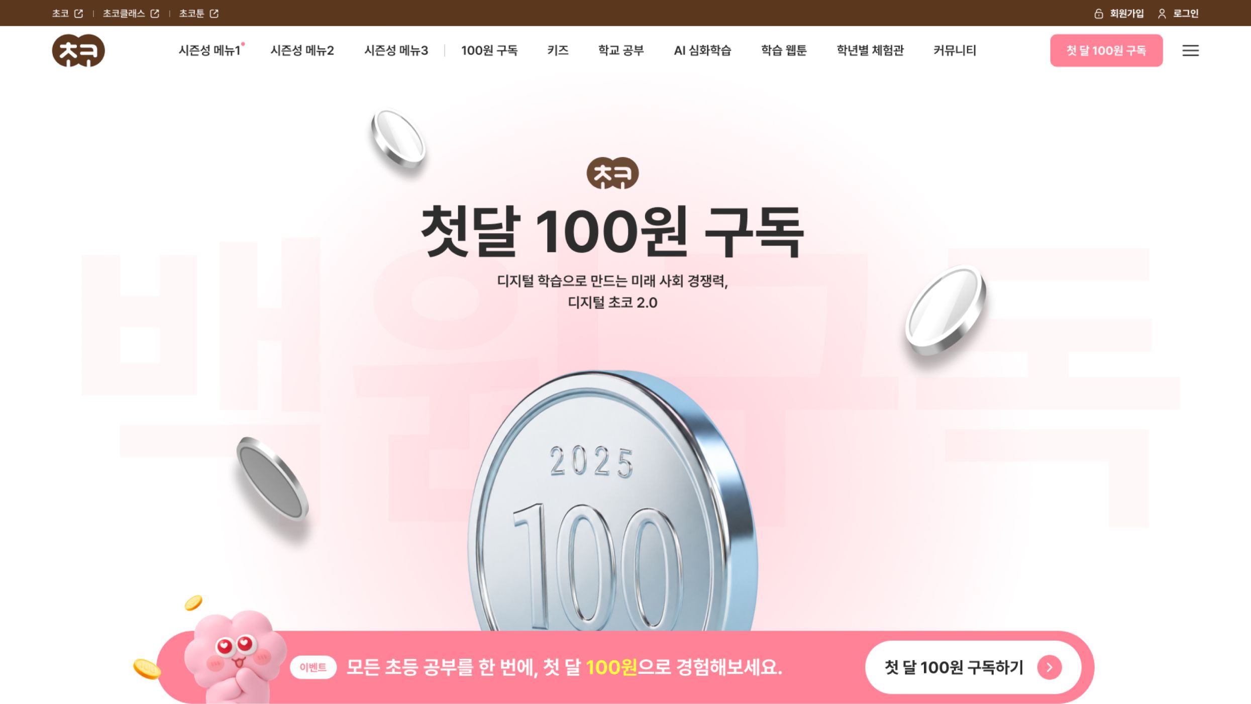
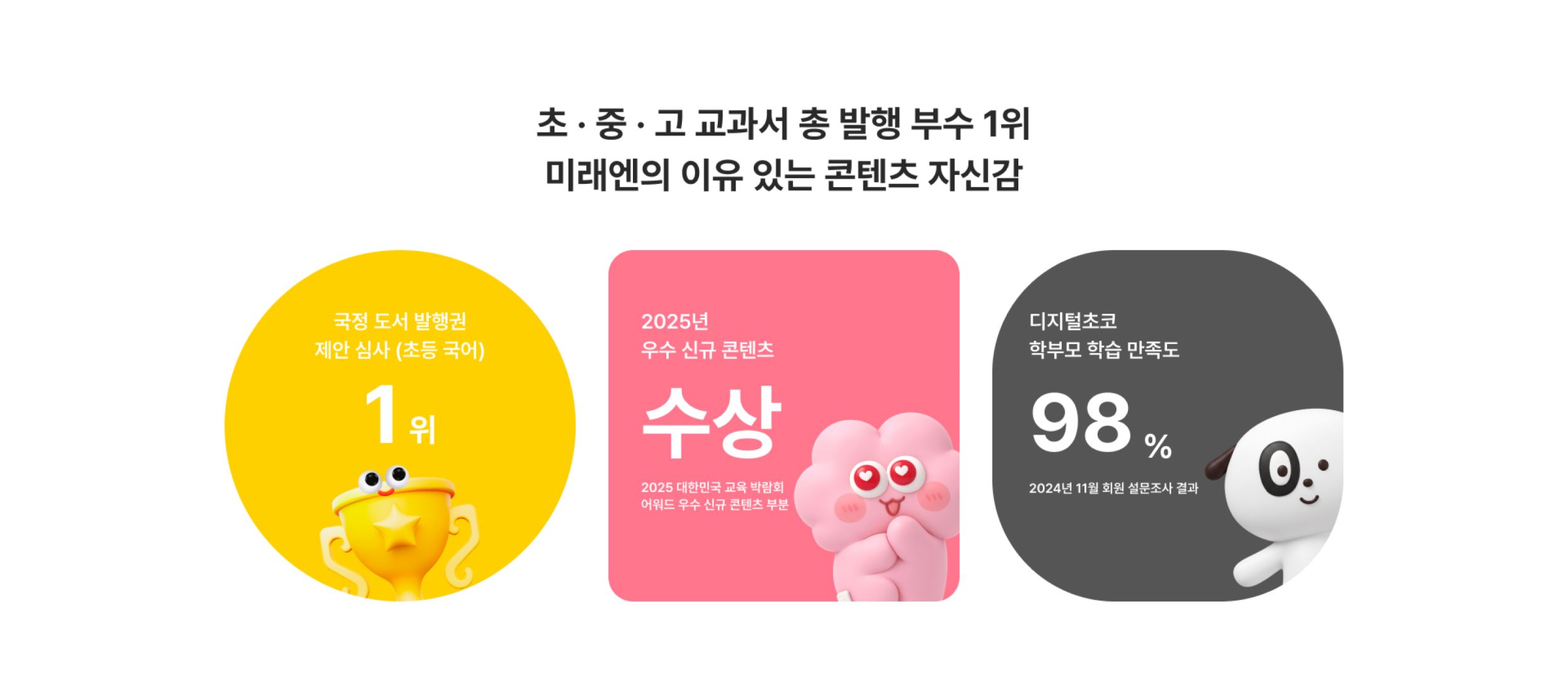
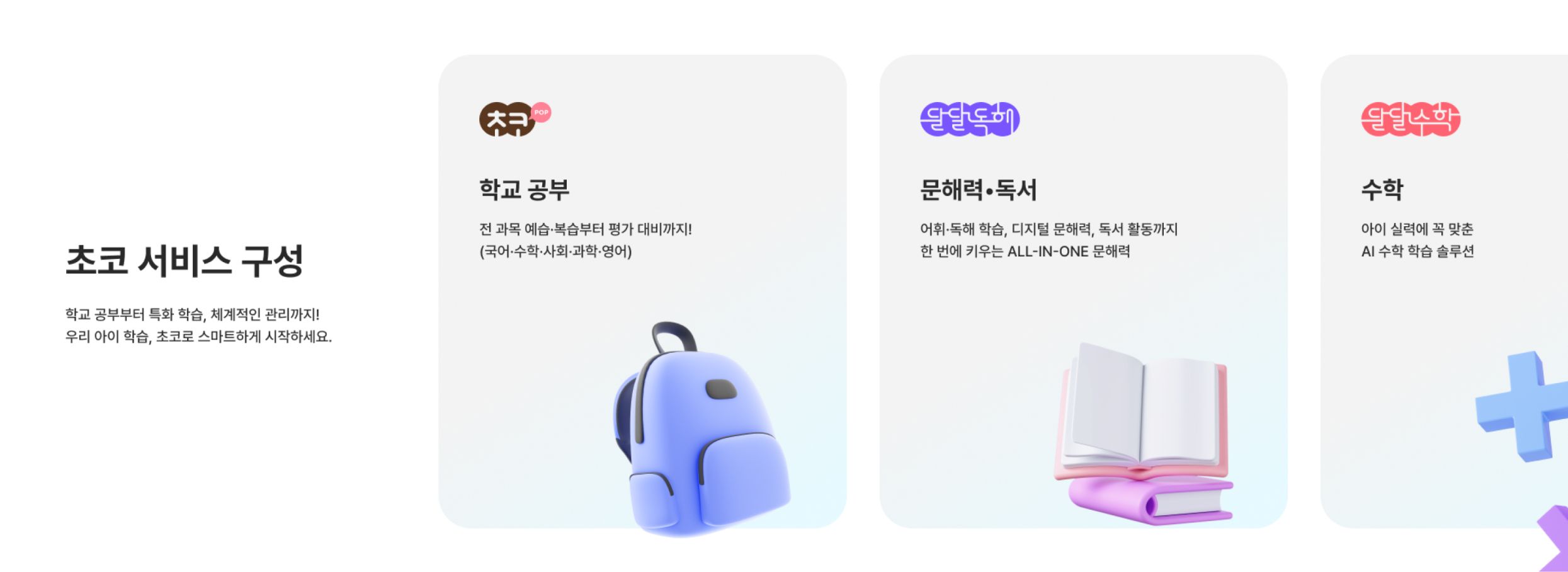
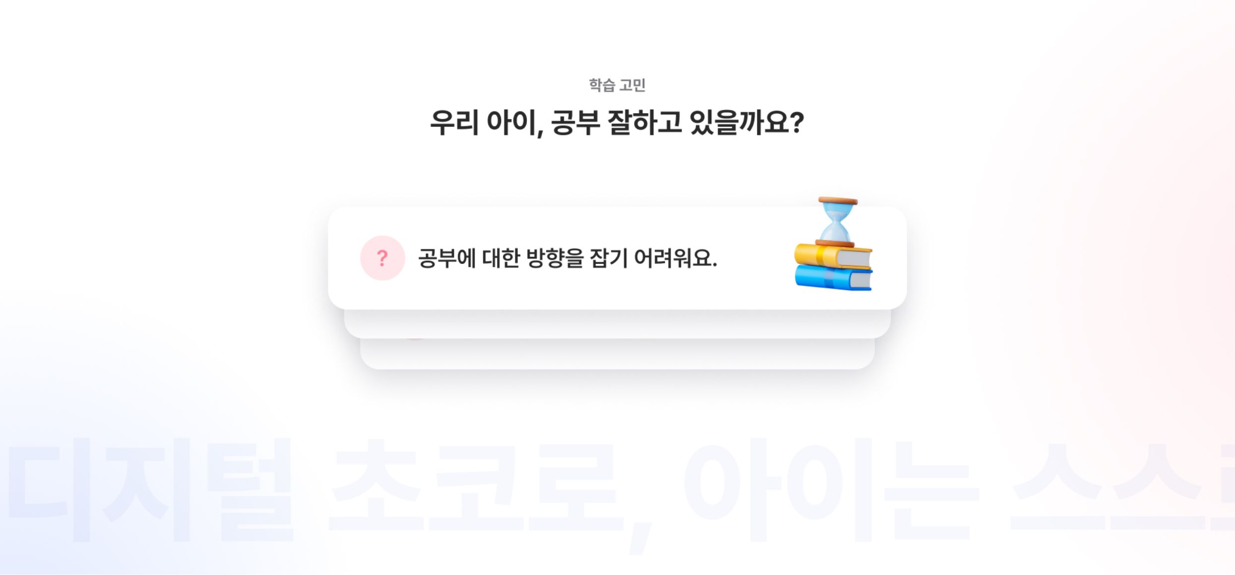
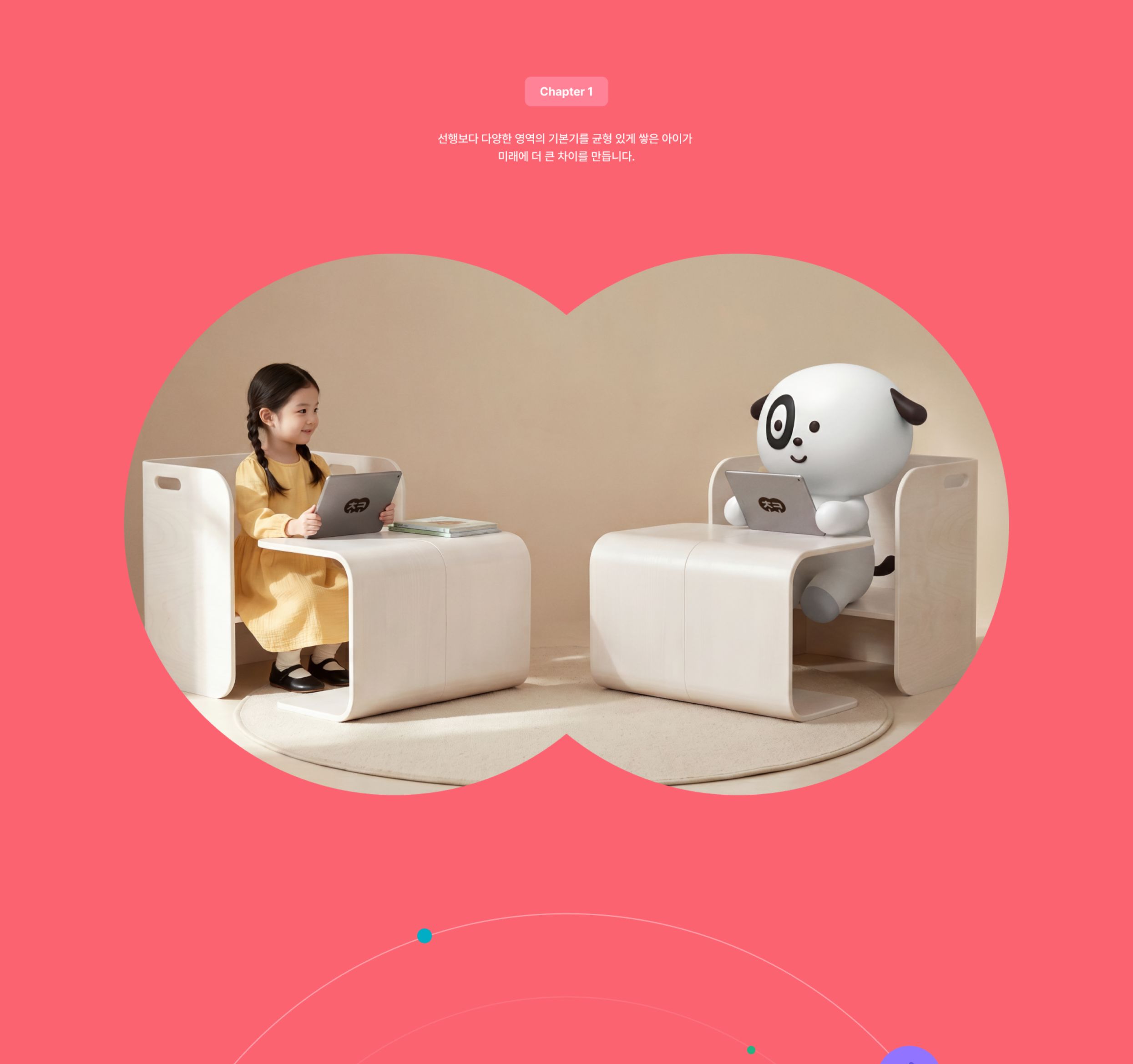
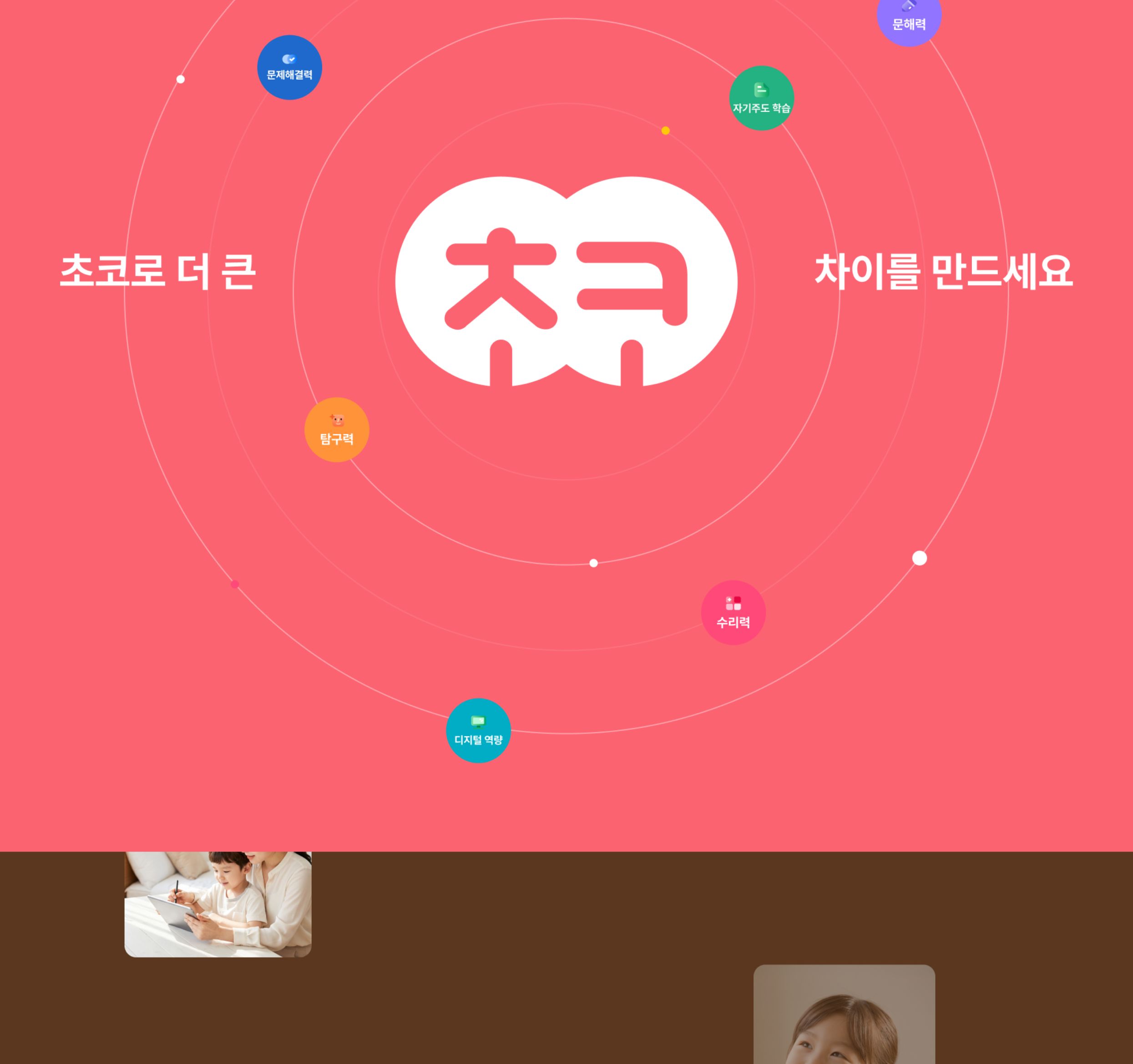
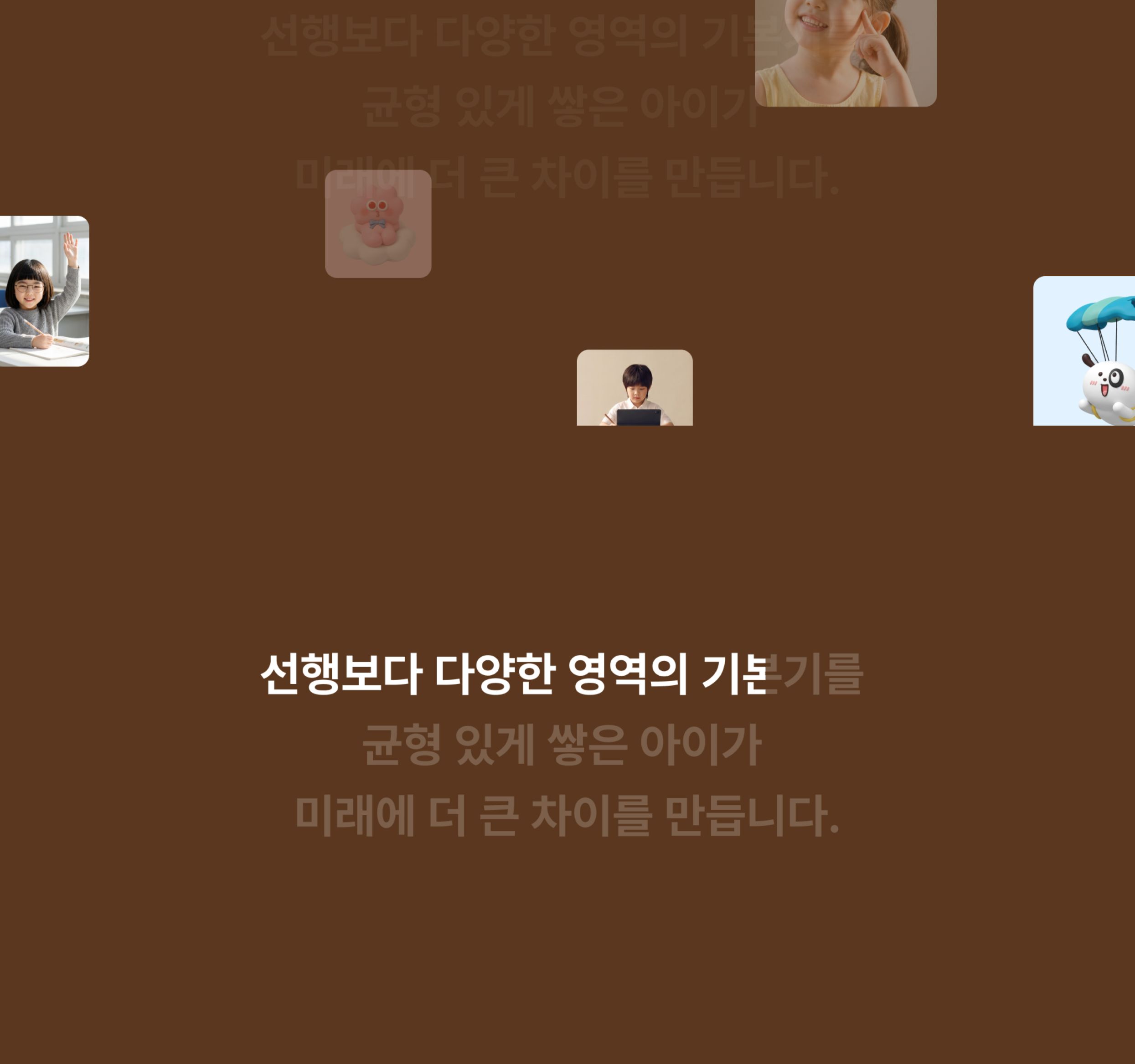
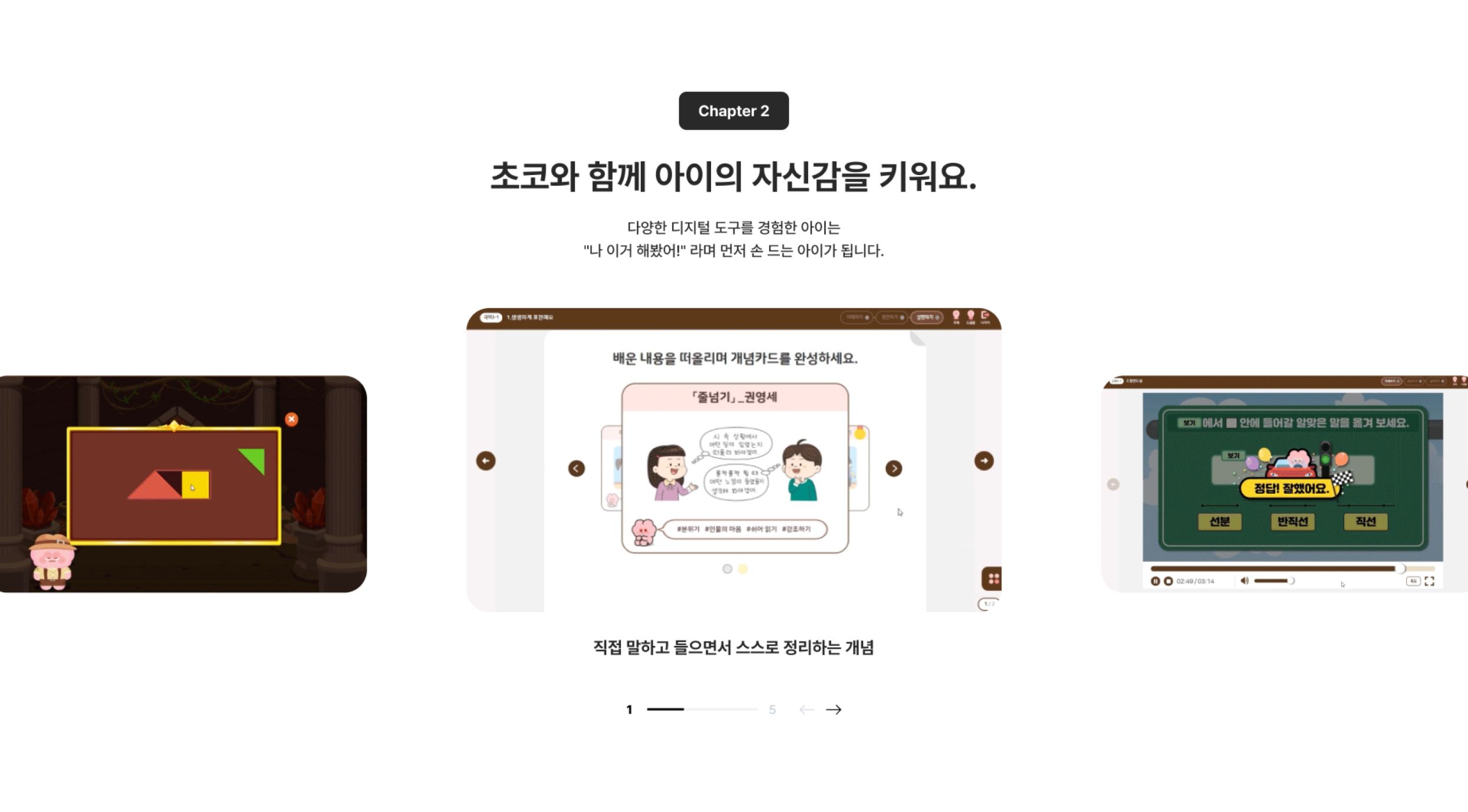
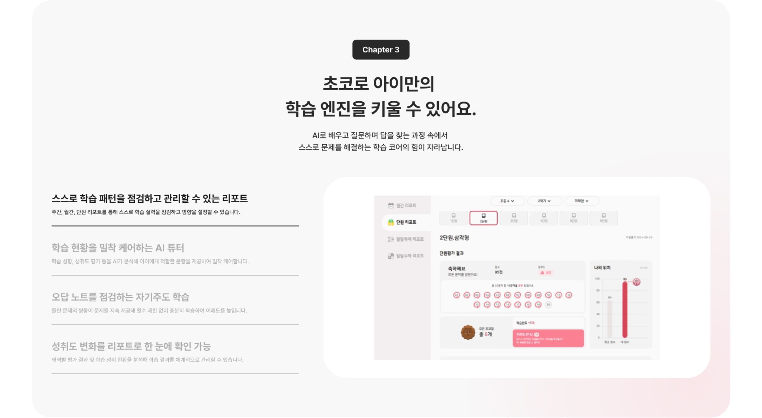
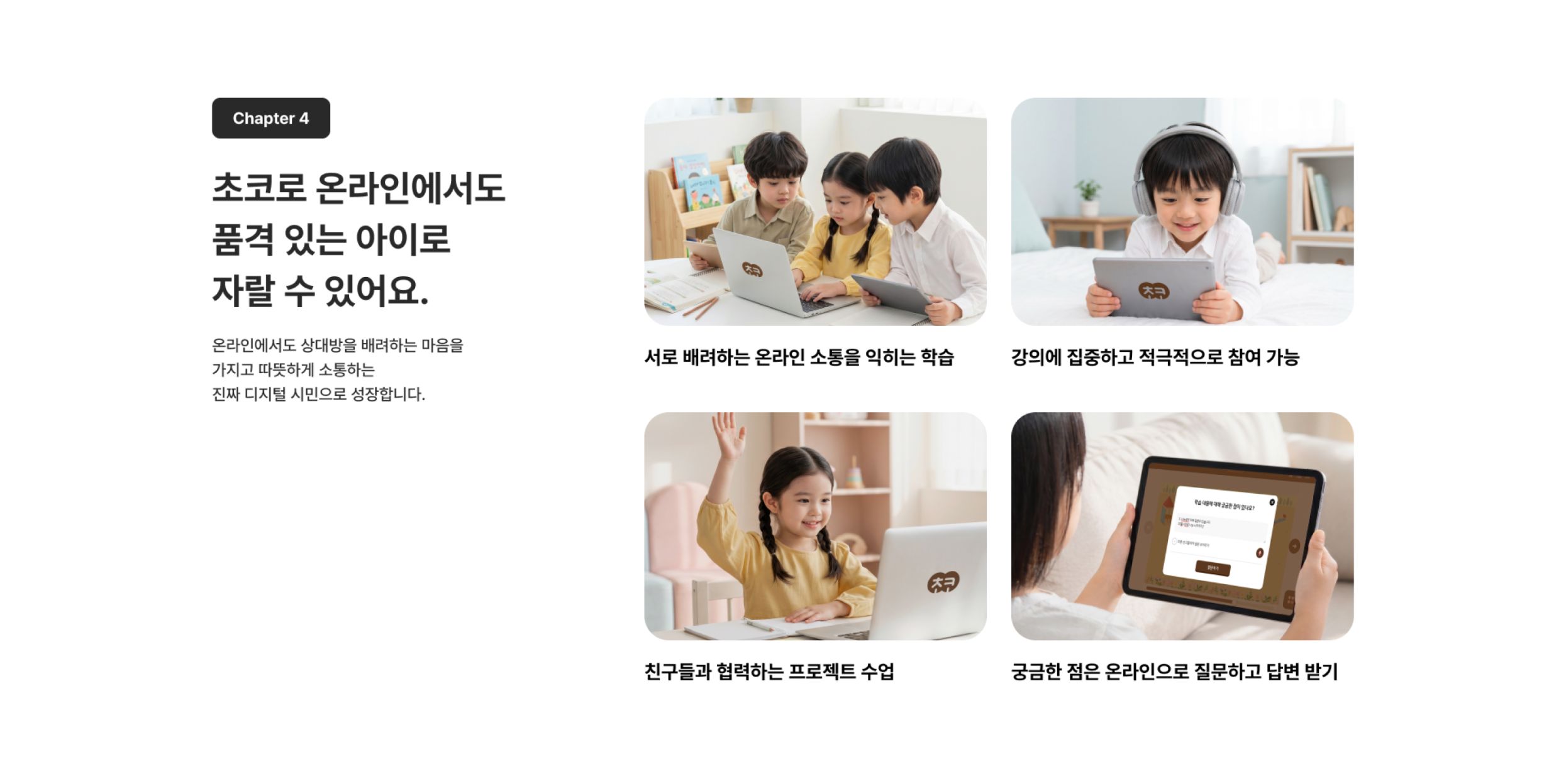
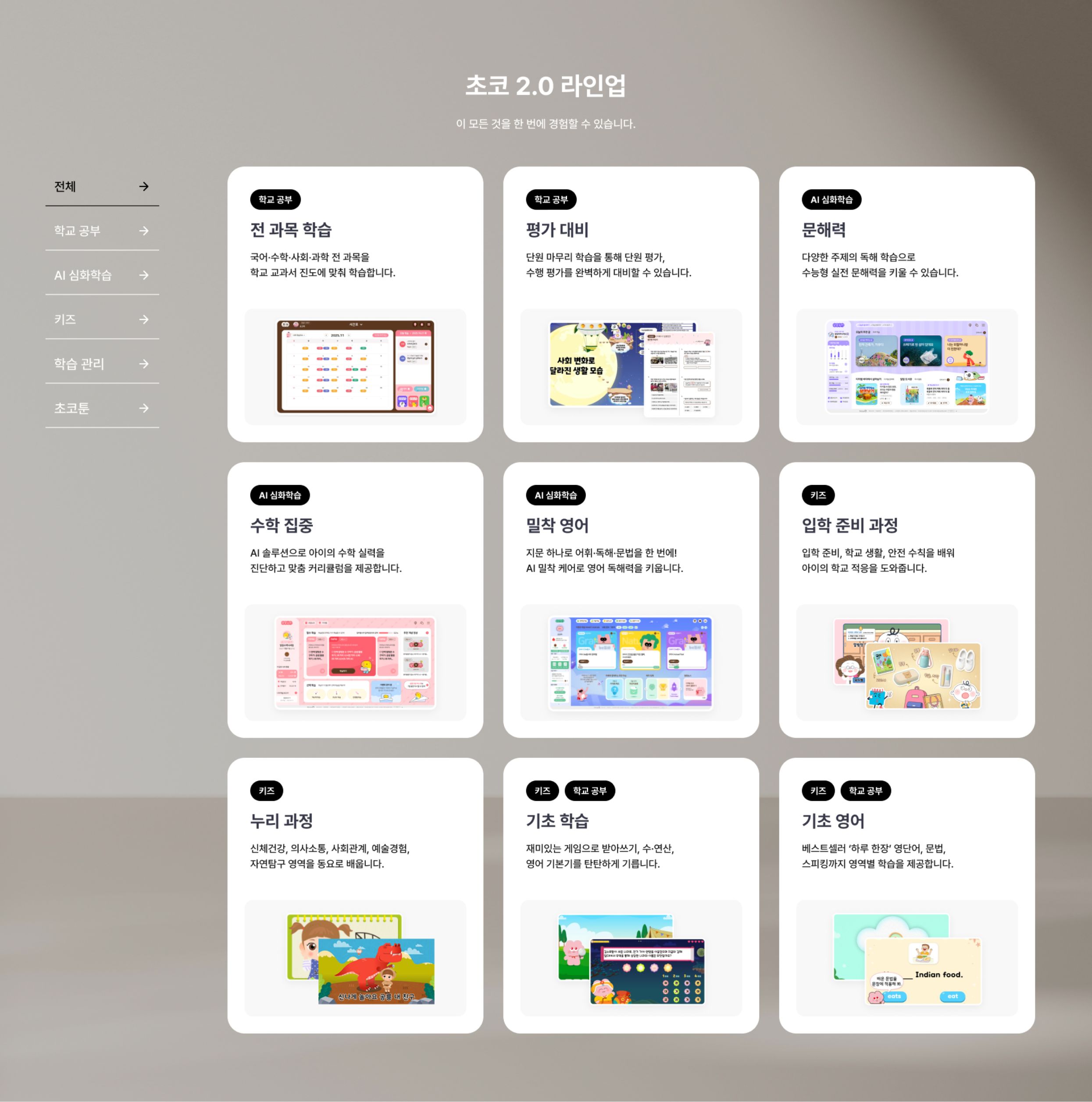
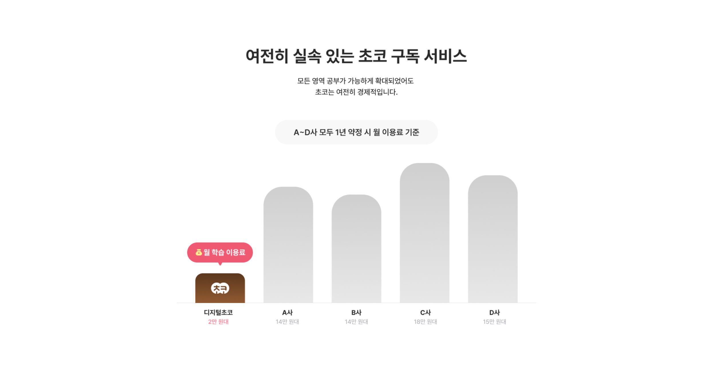
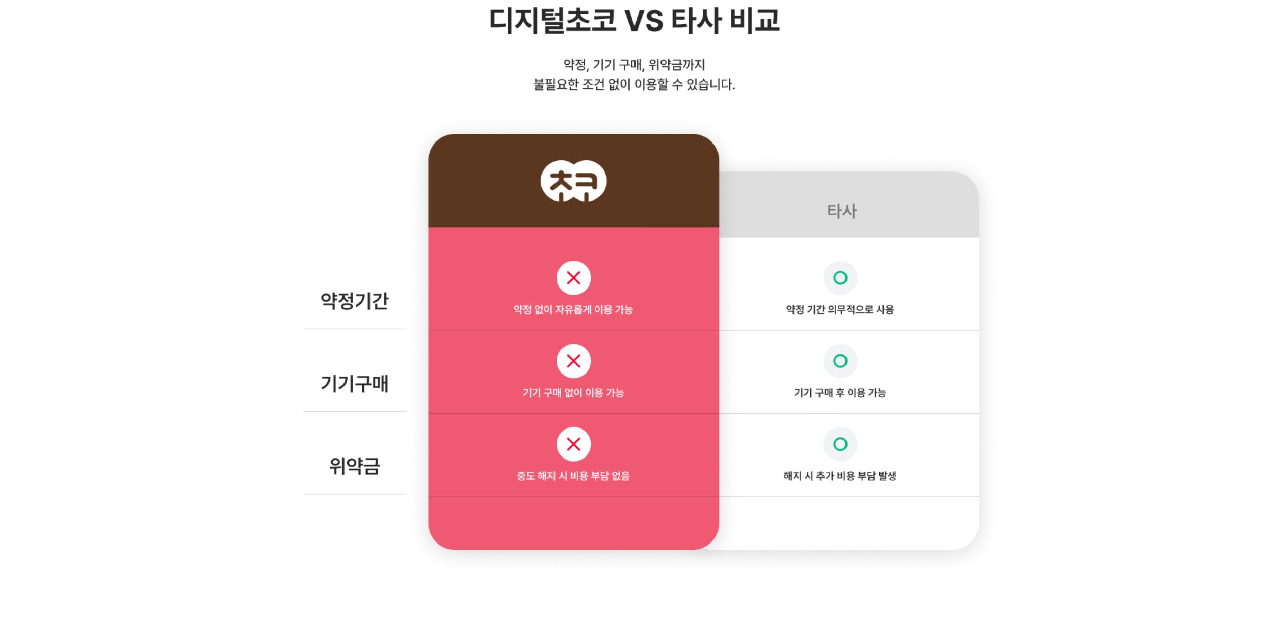
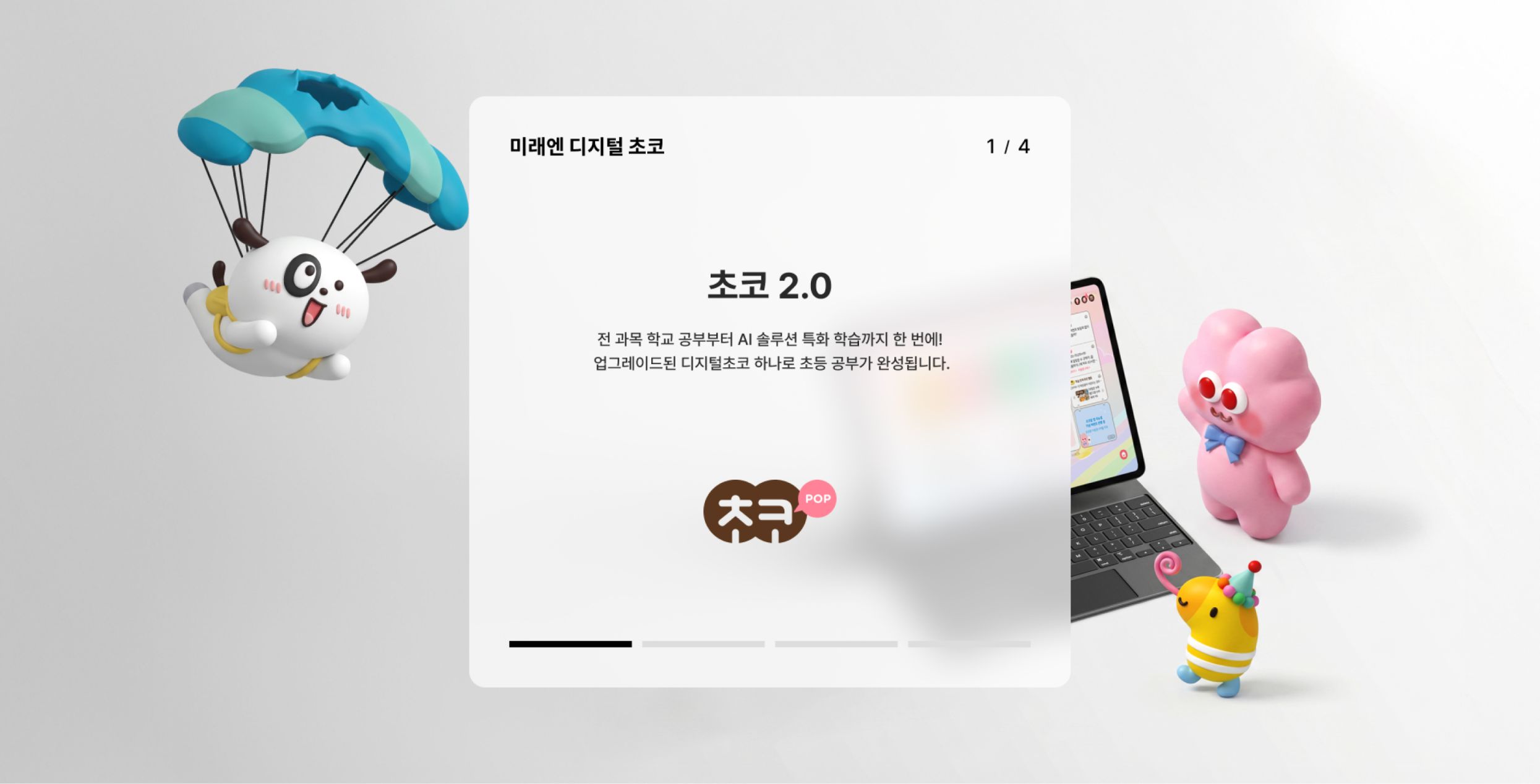
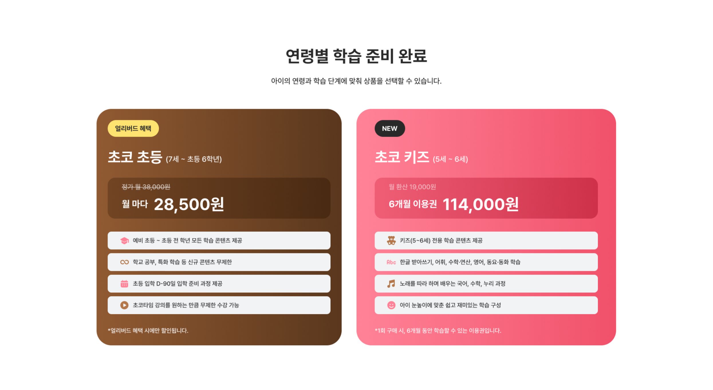



Pink tones, characters and graphic elements draw attention, while subscription CTAs placed in each key section
create a natural flow from checking the benefits to subscribing.
Lighter Price
Smarter Learning
With Choco

Visual Identity & Design System
An integrated design system
that connects the personality of each subject
Keeping each subject's colors and logo while unifying typography, cards and buttons under common rules,
we built a design system that feels friendly to children and trustworthy to parents.
-
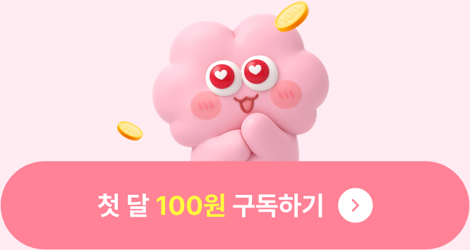
CTA Button
A subscribe button that shows the 'First month for 100 won' offer
at a glance, together with the characters 
-
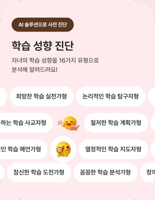
Passionate learning leader
Meticulous learning analyst
Logical learning explorer
Dreaming learning leader
Creative learning designer
Type Chip
16 learning types designed as rounded tags
so even a lot of information looks light and friendly
Pretendard
Headline & BodyPreview
Font Family
A B C D E F G H I J K L M N O P
Q R S T U V W X Y Z


Responsive & Design Handoff
From a structure centered on learning content
to one centered on user goals
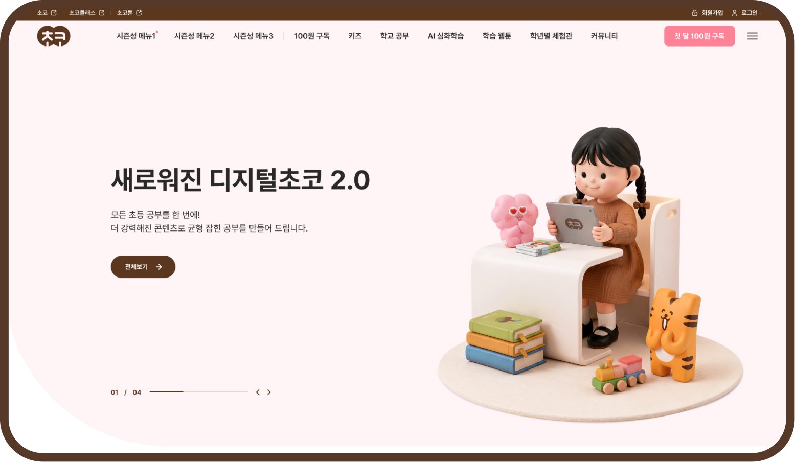
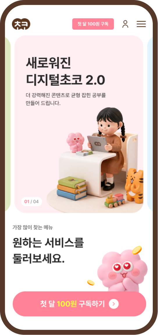
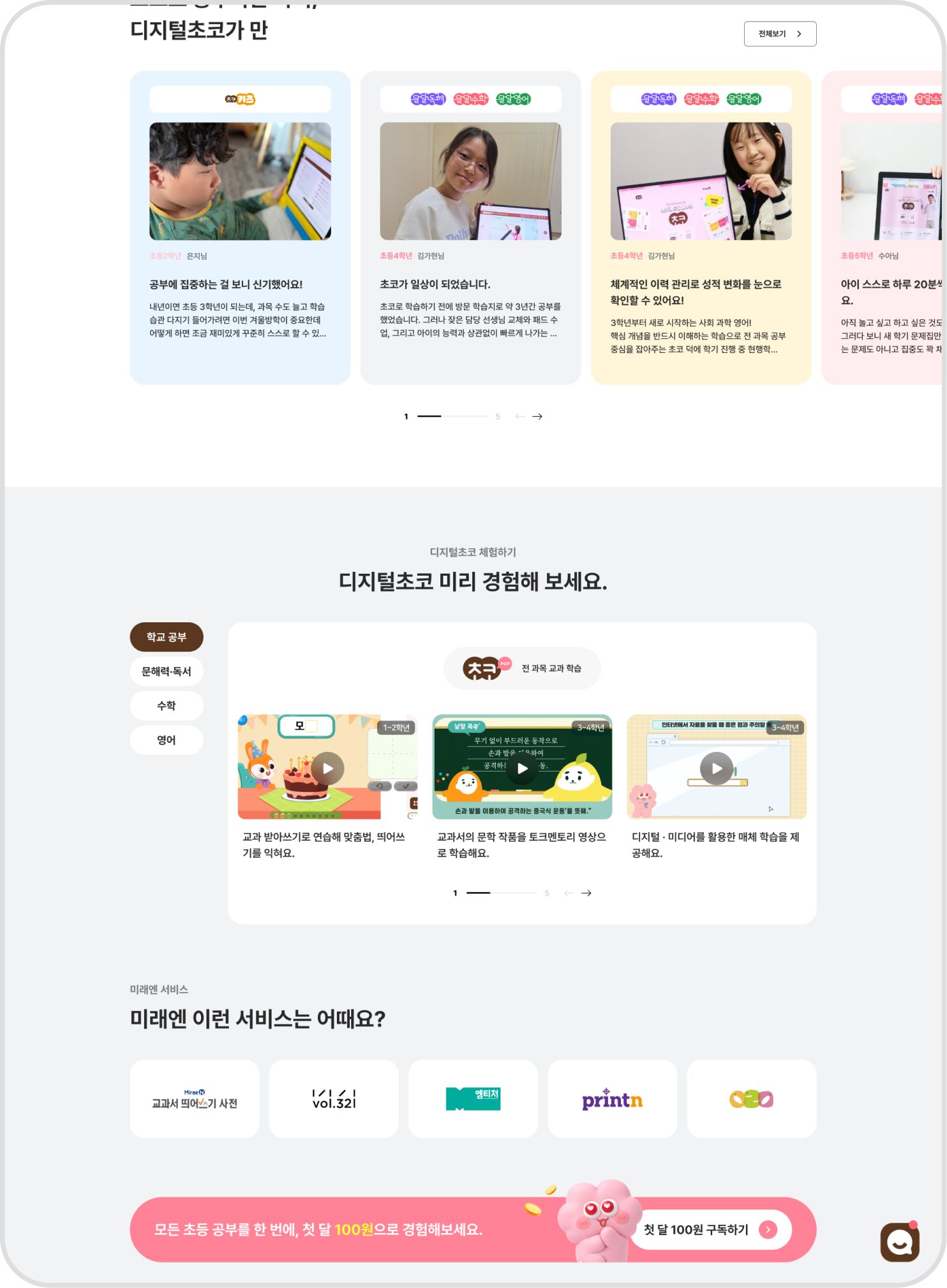
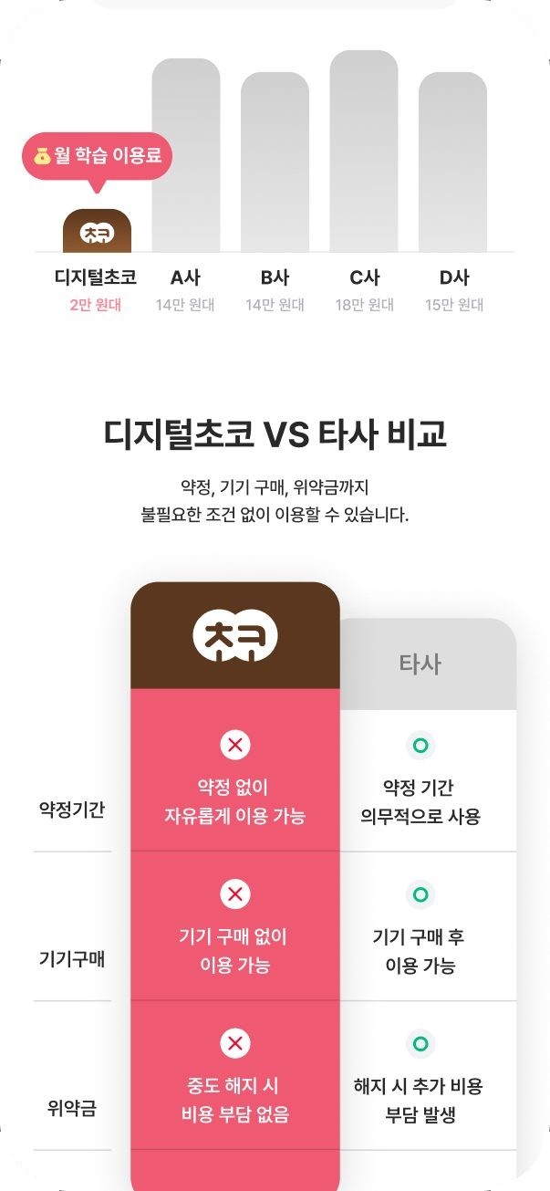
We designed the screen structure so users can quickly and easily find what they want among many subjects and services.
Children get intuitive navigation and engagement, parents get a clear picture of the service's features and benefits, and depending on the nature of the content,
we organized priorities and navigation flows.
A seamless experience
for exploring learning content
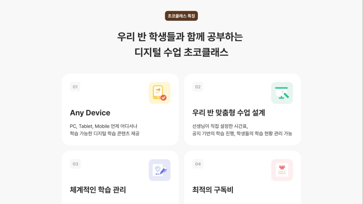
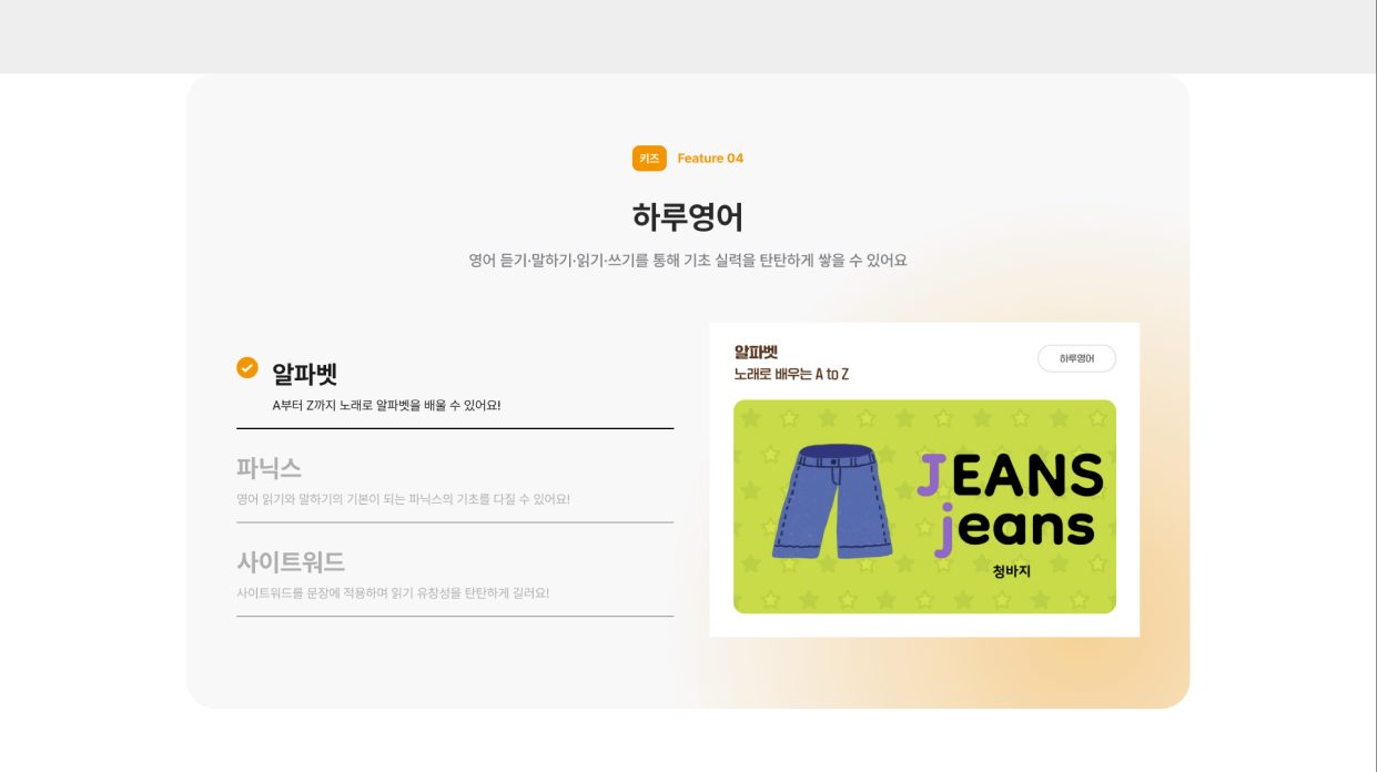
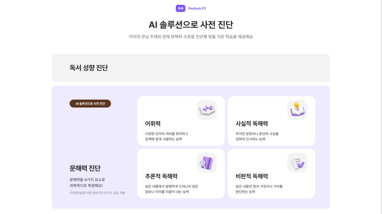
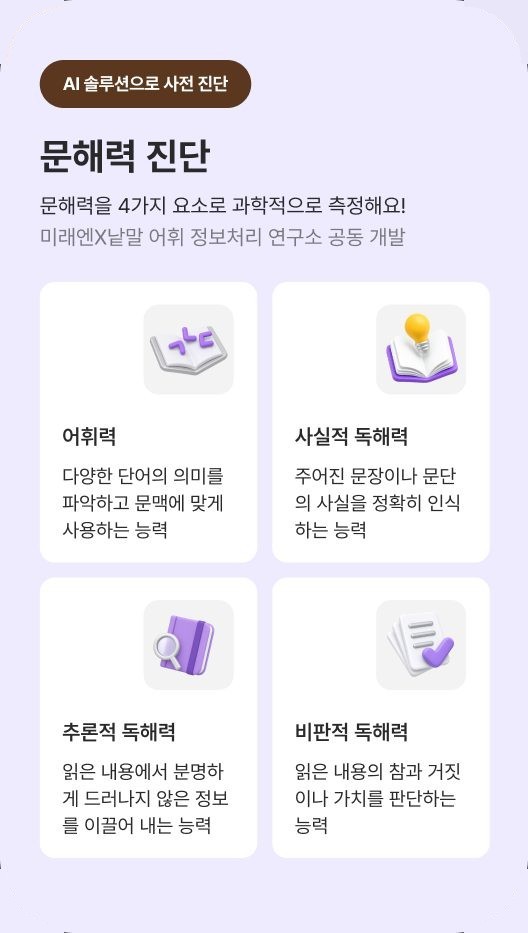
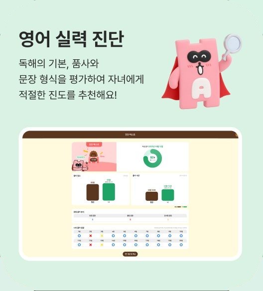
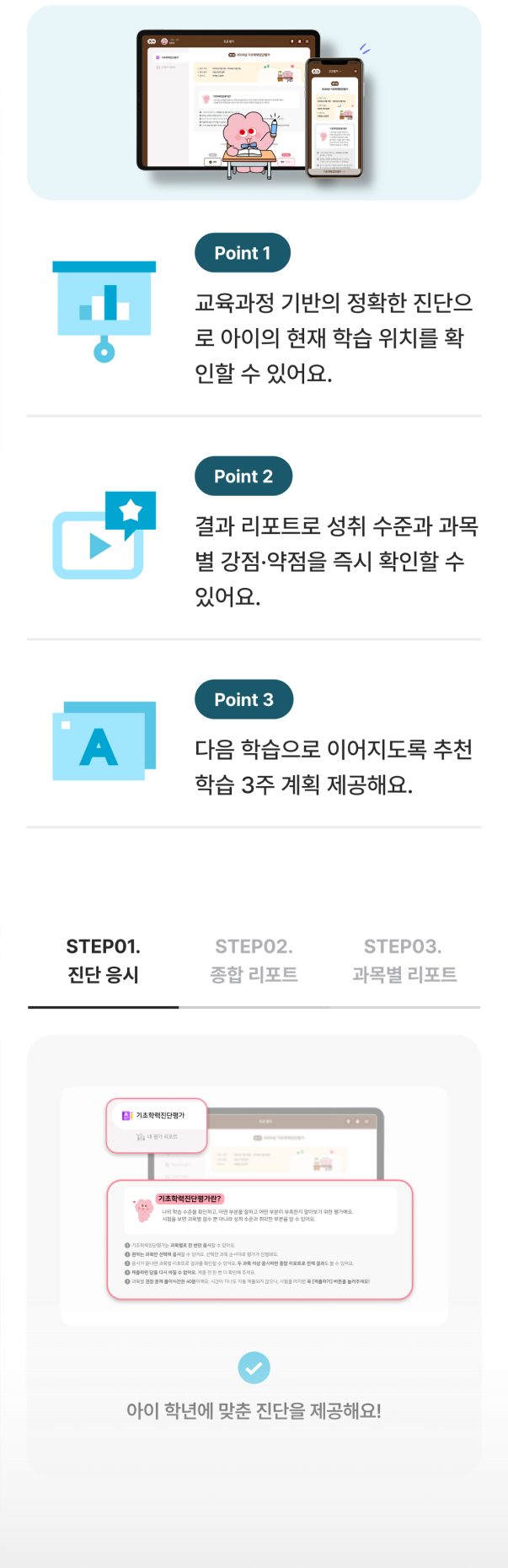
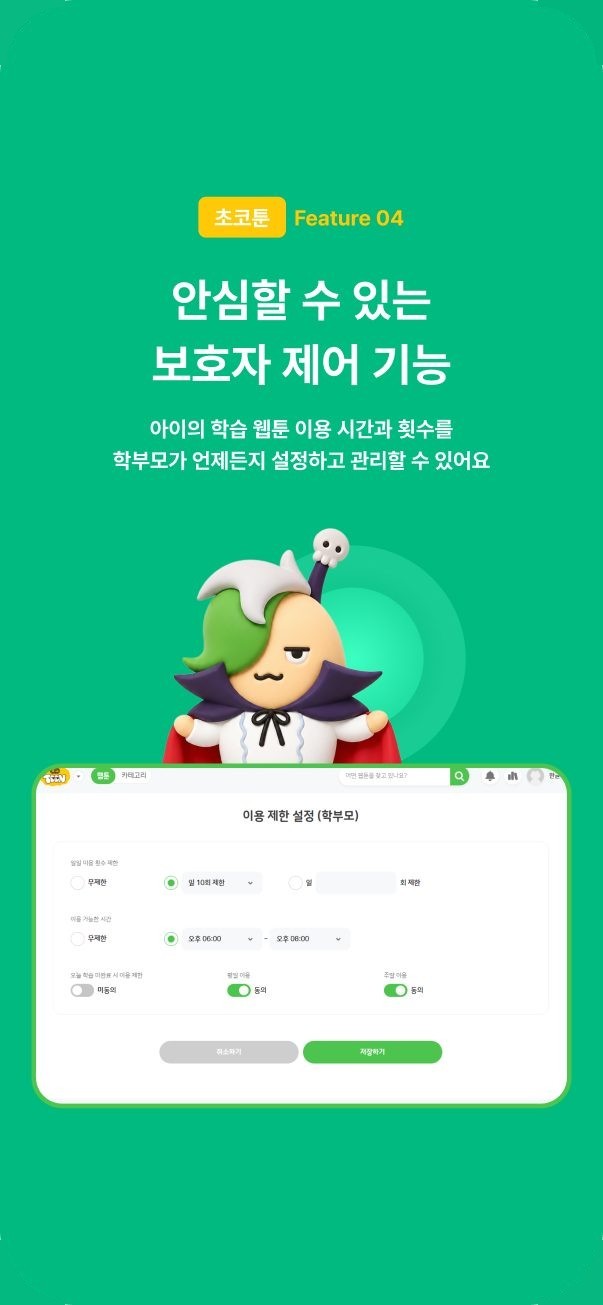
We designed the information architecture and UI so users can intuitively explore learning webtoons and AI advanced learning content.
Learning webtoons spark interest with covers and characters, while AI advanced learning visualizes diagnosis, vocabulary and reading data with cards, graphs and tabs
for better understanding.
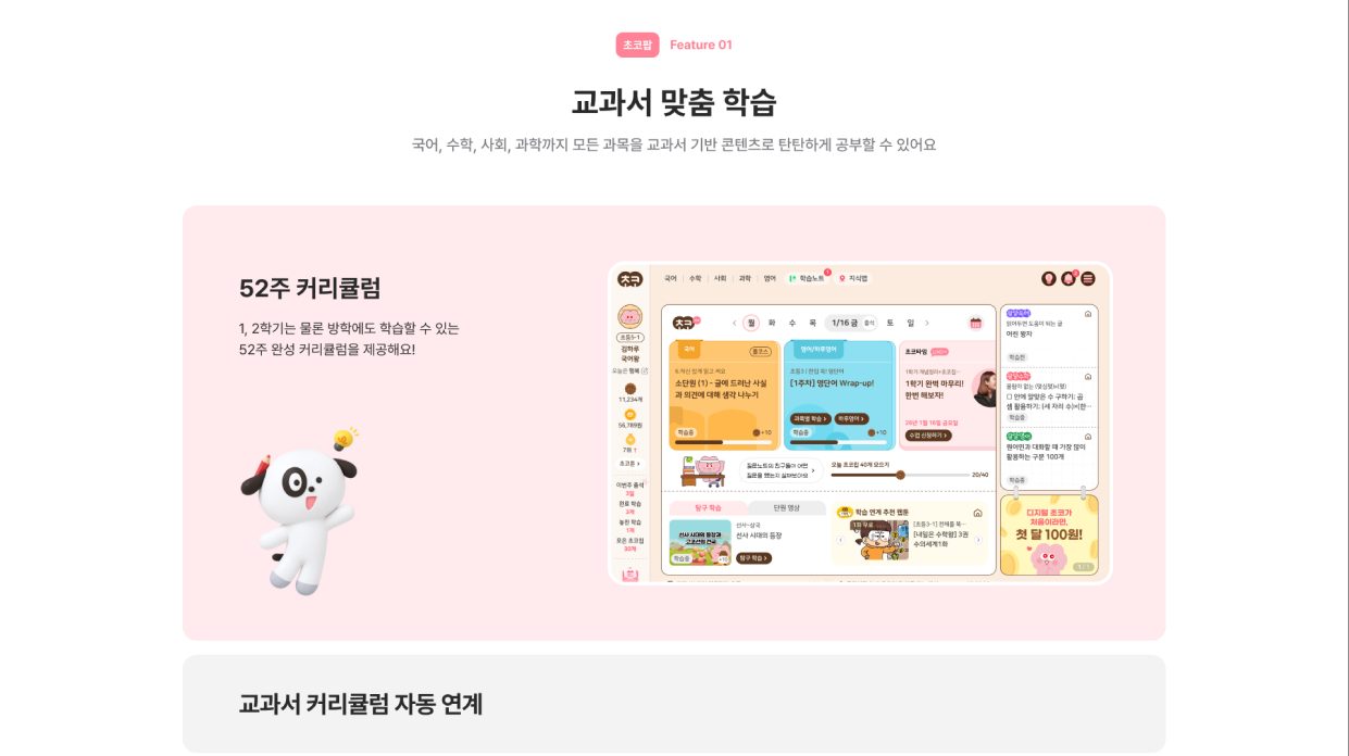
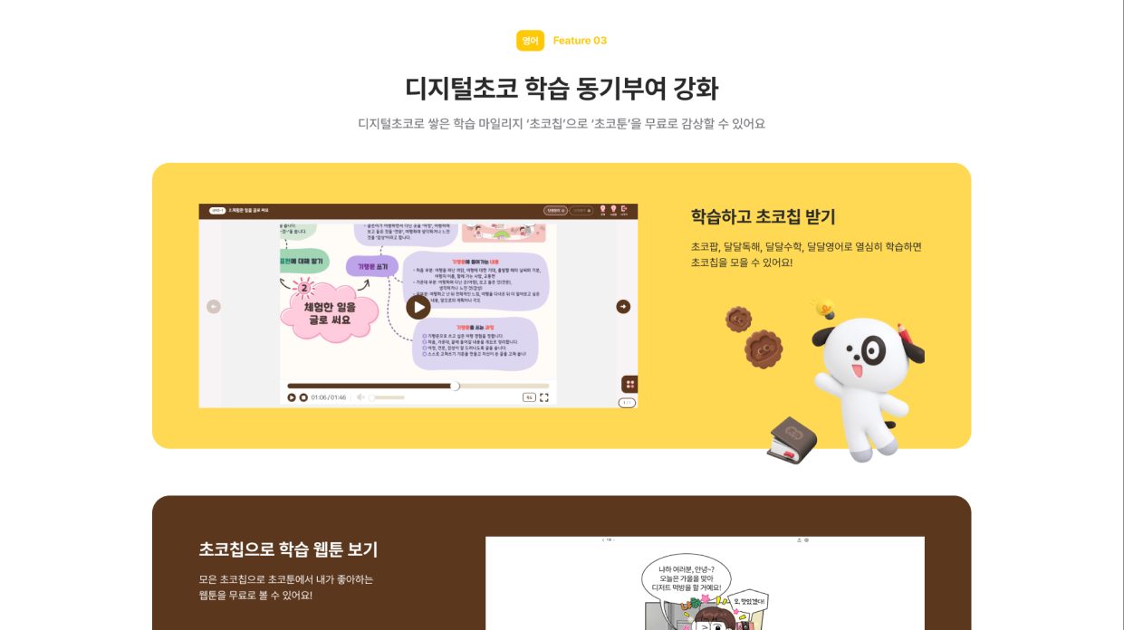
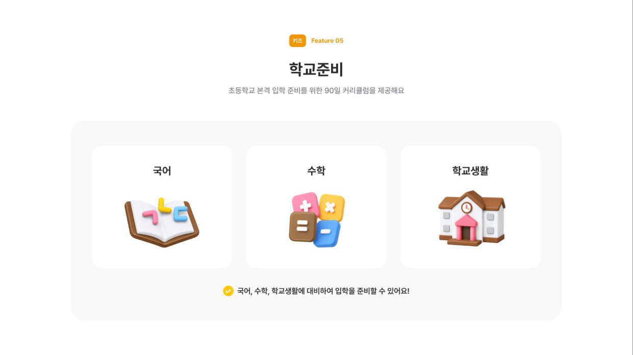
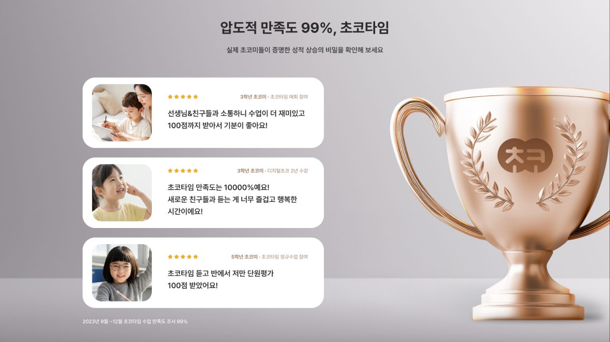
Responsive screen design
for every device
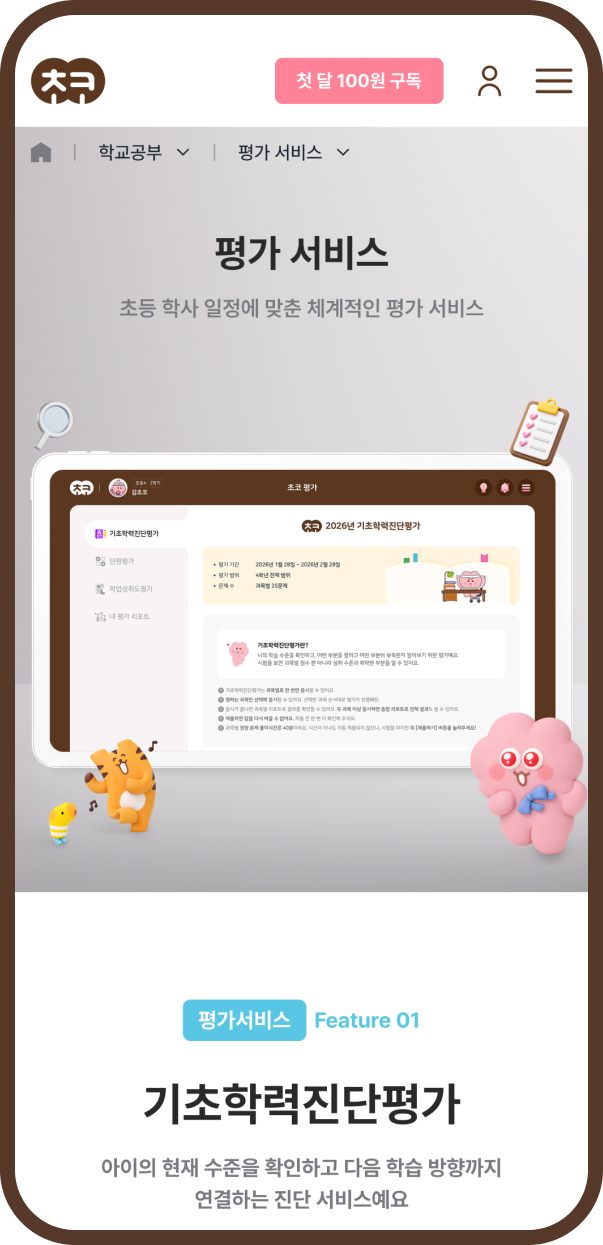
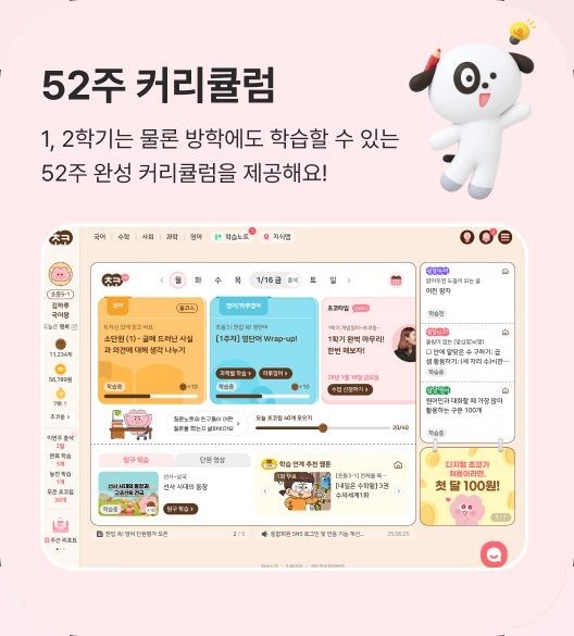
We designed responsive screens to deliver a consistent experience on PC, tablet and mobile.
Layouts are rearranged to fit each screen size, preserving readability and convenience on mobile,
and device-specific screens were provided so the design intent carries through to the live service.
Key Results
Renewal goals and expected impact
needed improvementTime to find key content
expected to drop 20%
neededBrand understanding
expected to rise 20%
needed improvementTime spent on service pages
expected to rise 15%
needed stronger alignmentSubscription CTA click-through
expected to rise 20%
needed systematizingPublishing coordination time
expected to drop 25%
expected to drop 20%
expected to rise 20%
expected to rise 15%
expected to rise 20%
expected to drop 25%
FAQ
Frequently asked questions
-
A
For an elementary education platform, it is important to consider the goals of both the child, who is the actual learner, and the parent, who is involved in choosing the service. Digital Choco's screens use characters and colors that appeal to children while clearly conveying the service information and educational value parents need. We toned down an overly childish feel and focused on balancing engagement with trust.
-
A
It is important to keep each brand's unique colors and logo while applying shared UI and layout rules to deliver a consistent brand experience. When high-quality images are scarce, generative AI imagery can raise the visual quality. However, producing high-quality AI images requires its own planning and production process, so the scope and quantity are agreed with the client based on the project's goals and budget.
-
A
Yes, absolutely. Depending on the project's goals and the client's development environment, Soijeong can take on UX/UI design alone. The Mirae-N Digital Choco project likewise focused on enhancing information delivery, visual quality and user experience based on the initial plan the client had prepared. We also systematically designed screens for PC, tablet and mobile to help the client's subsequent publishing and development run smoothly.
Where smart learning subscriptions begin,
Digital Choco 2.0